Charlotte Kelly — work
Snackville at Pacific Park
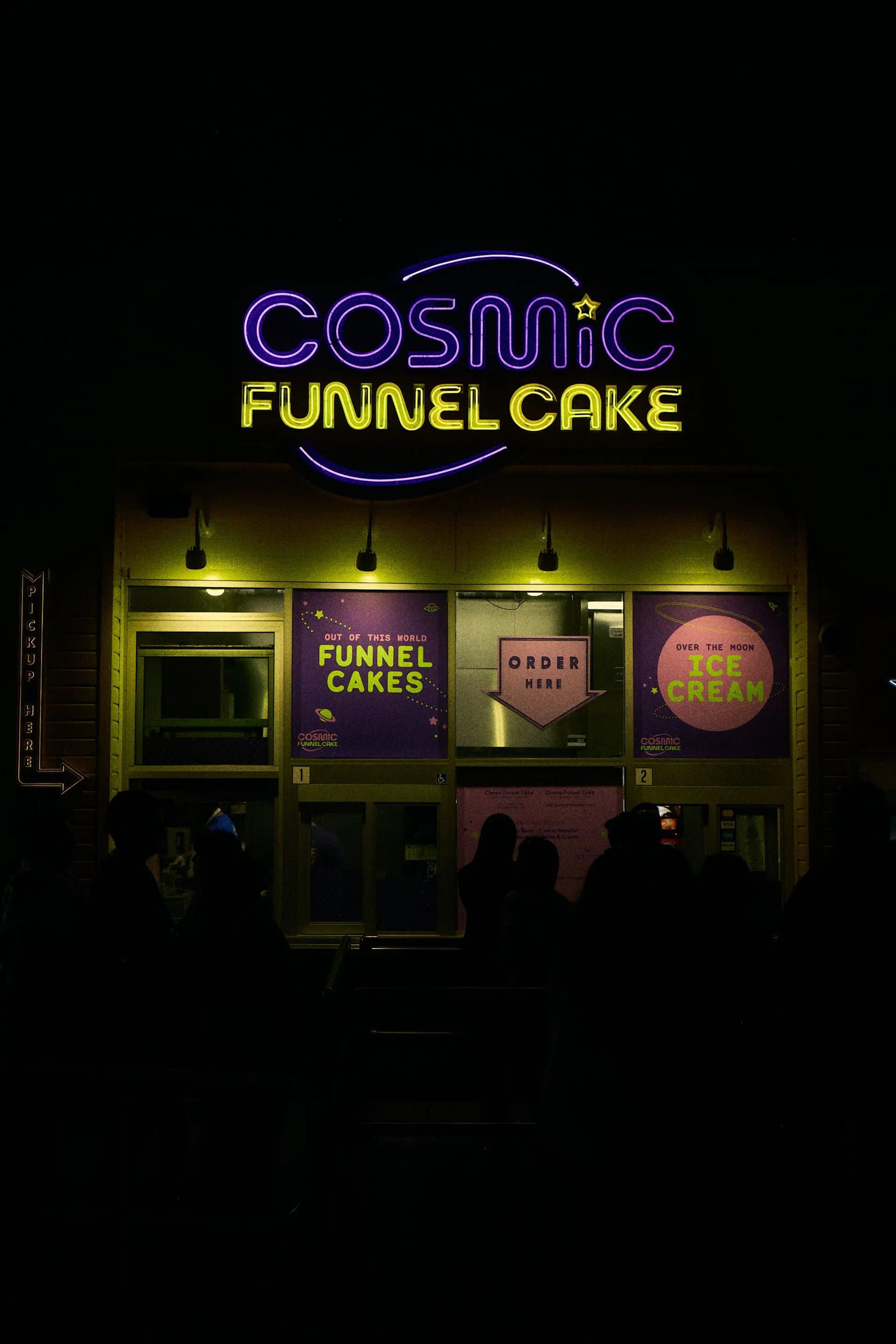
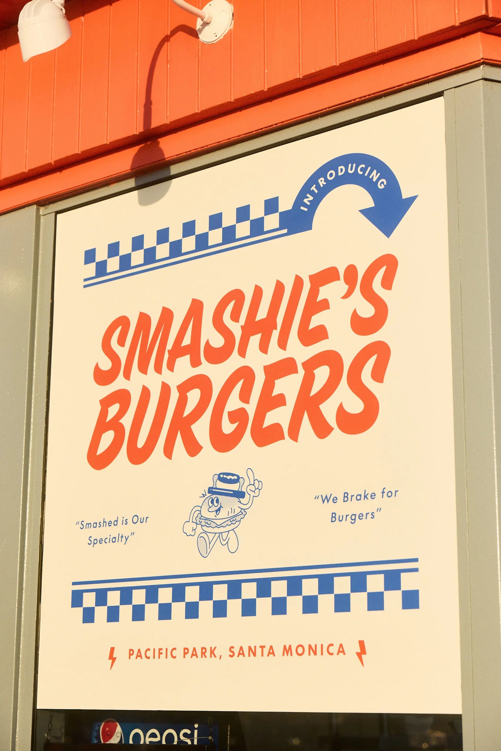
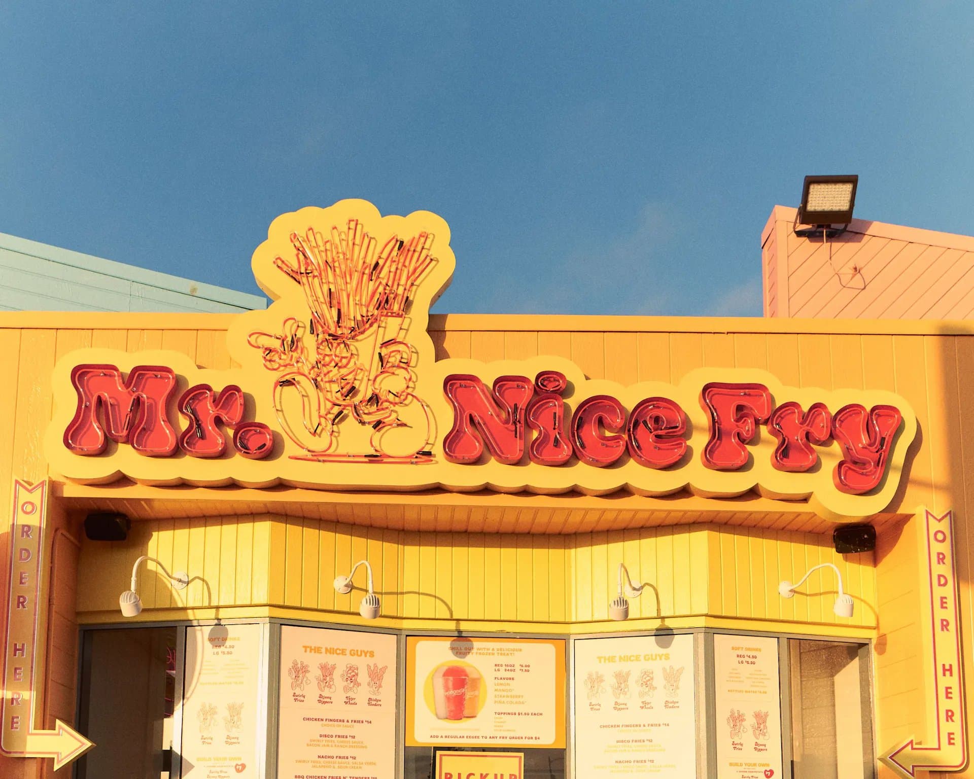
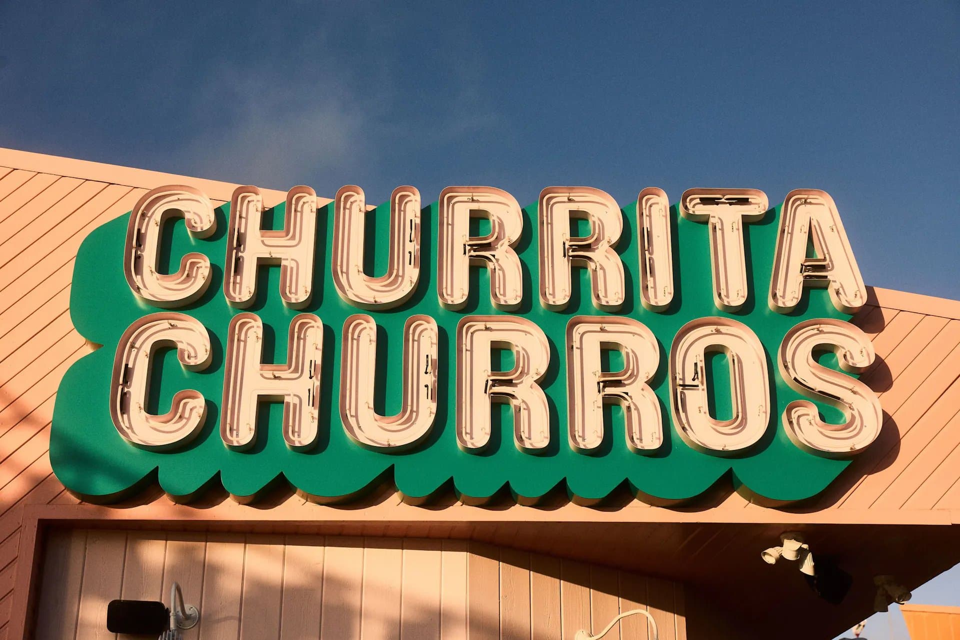
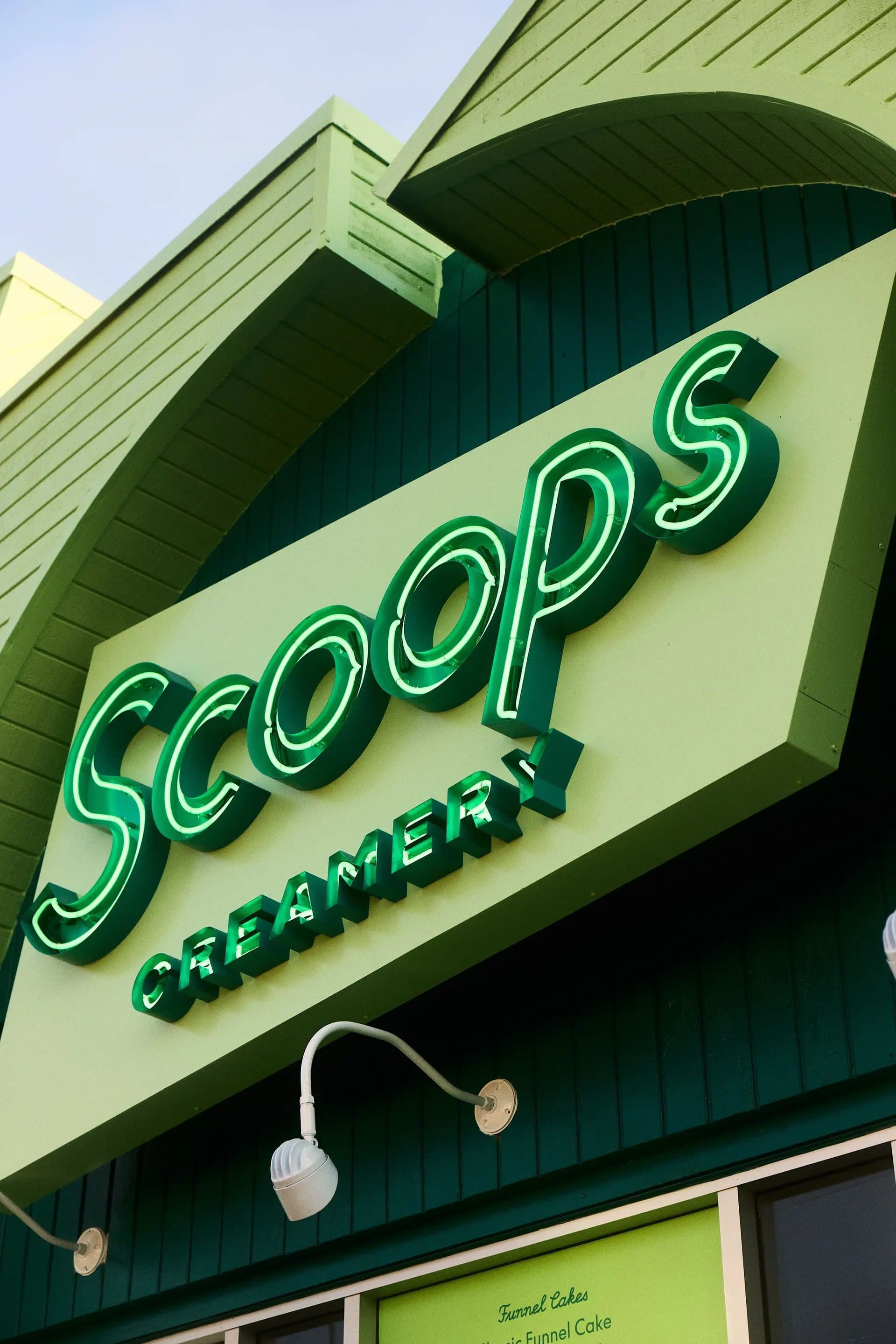
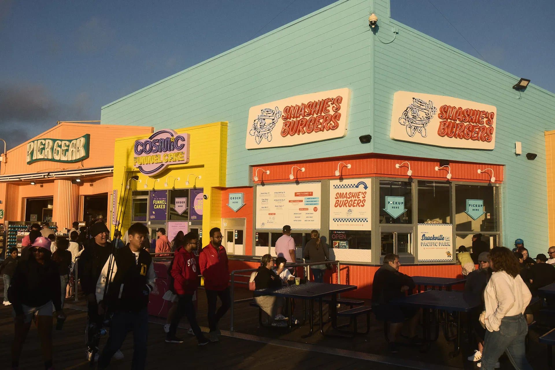
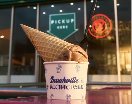
Welcome to Snackville at Pacific Park, the reimagined food court at the iconic Santa Monica Pier in Los Angeles.
- Naming
- messaging
- brand guidelines
See projectClose
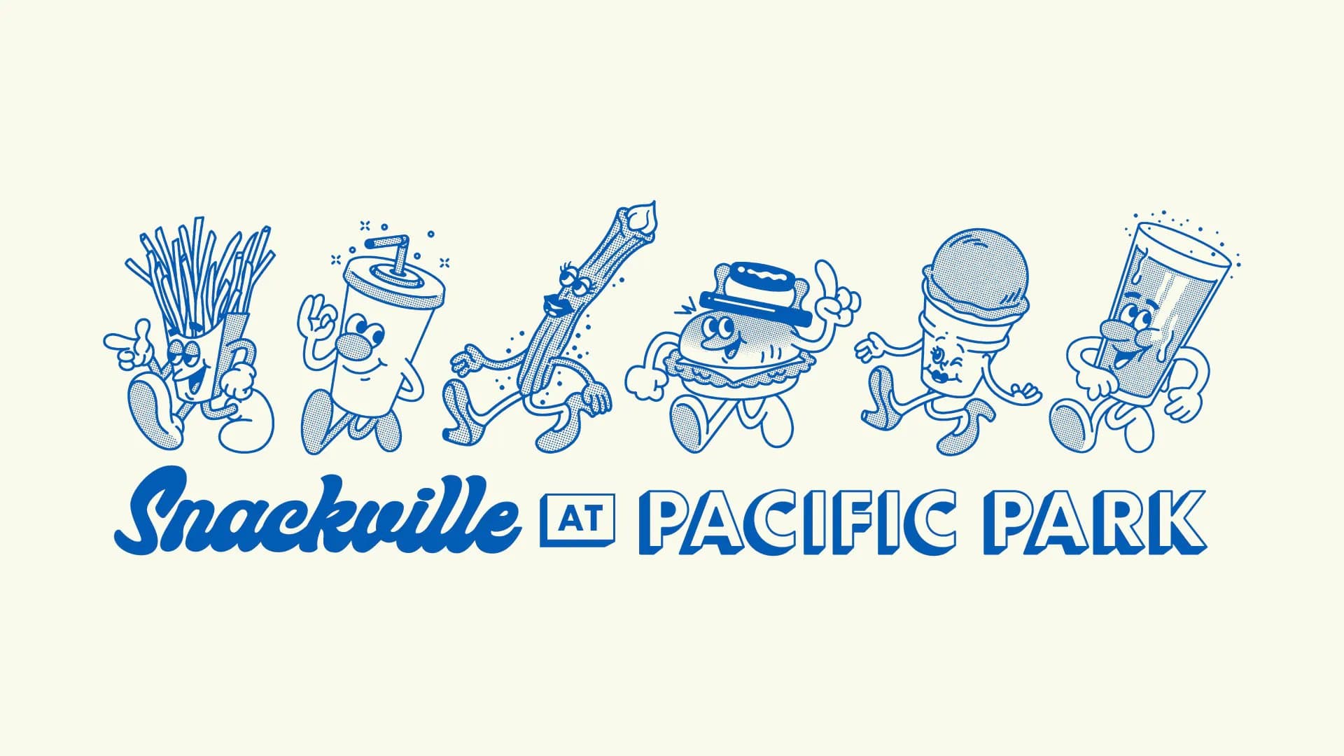
Welcome to Snackville at Pacific Park, the reimagined food court at the iconic Santa Monica Pier in Los Angeles. On the menu at Snackville: sweet treats, tasty bites, cold drinks, and more.
Working with a creative team assembled and led by NYC studio Zan Inc, we named Snackville and its five new food concepts, each with a standalone look and feel. I also created messaging for menus, swag, and signage and polished the brand guidelines. Now the fun and neon nostalgia people love about the pier is on offer at its food court, too.
- Role:
- Naming, Copy
- Studio:
- Zan Inc.
Nutrire
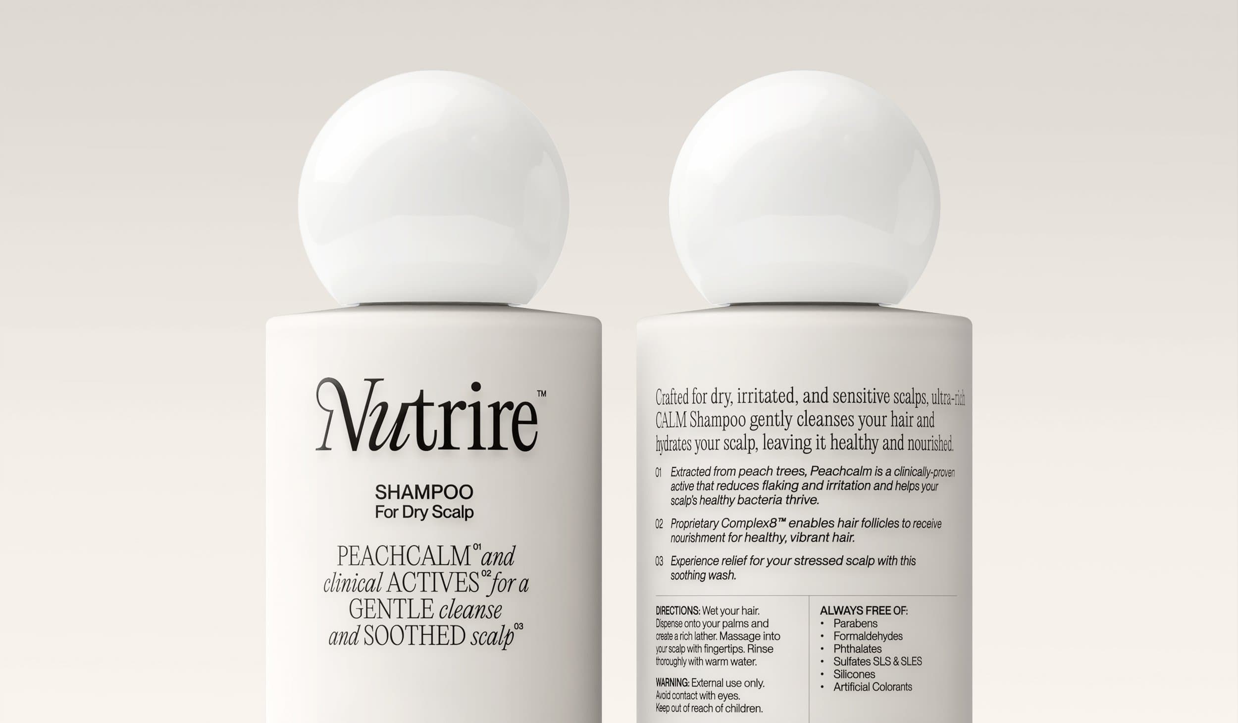
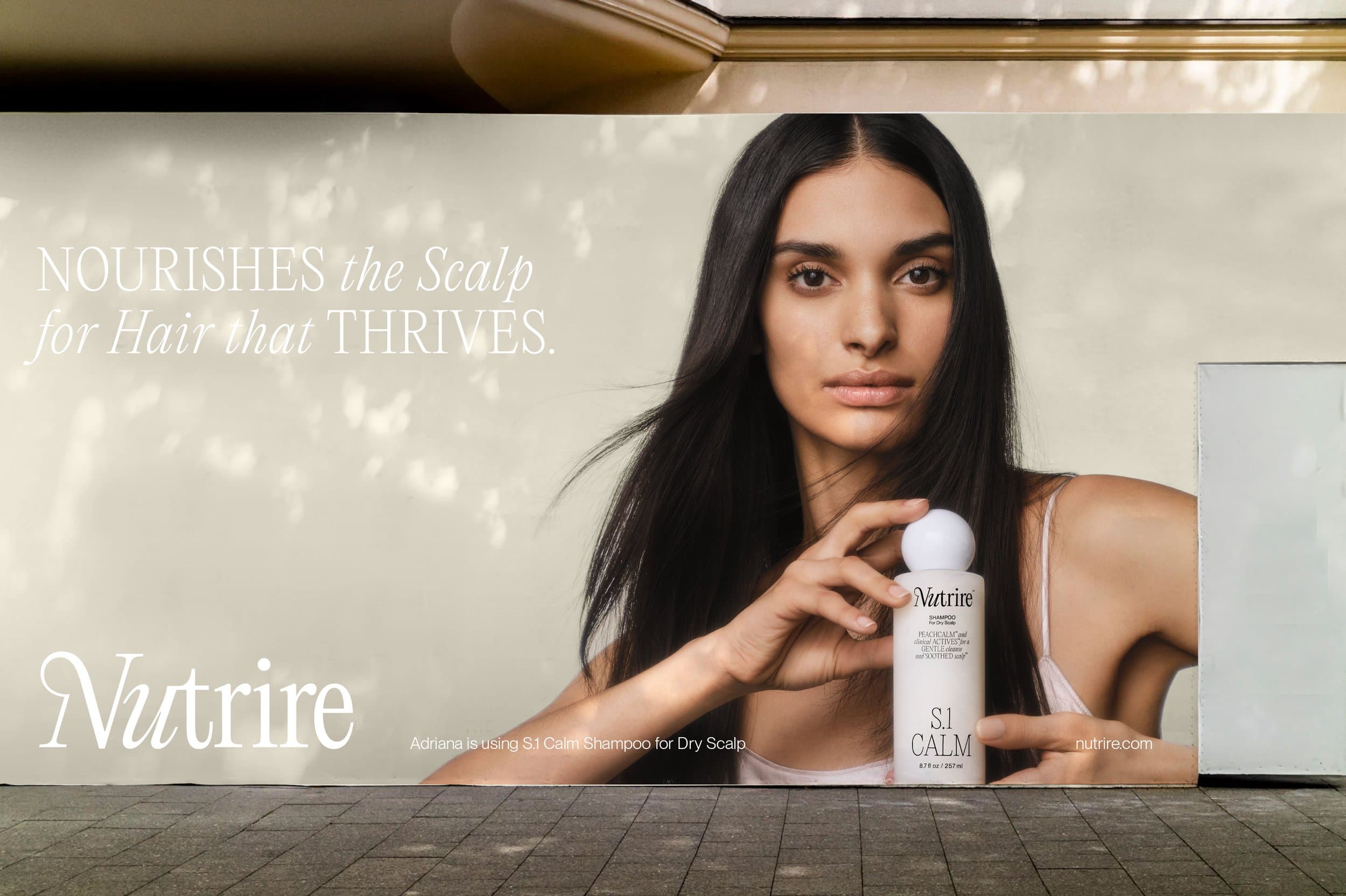
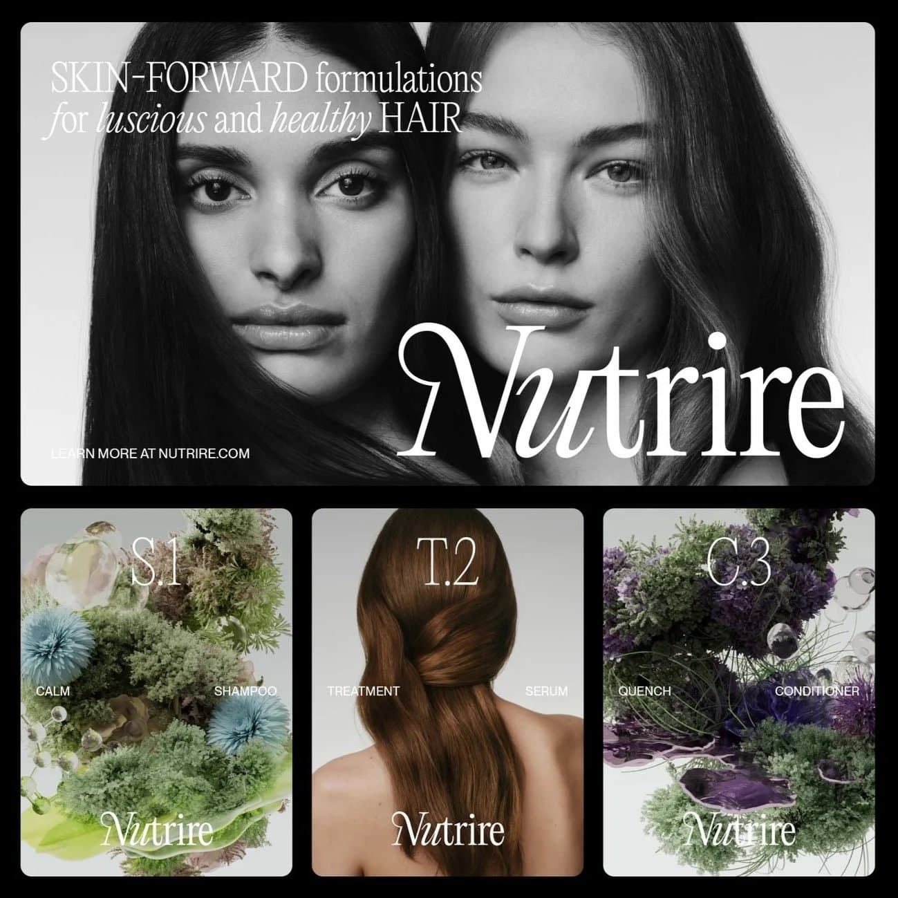
Nutrire is a line of haircare products founded on the principle that healthier hair begins with a nourished scalp.
- Creative concepts
- product naming
- packaging
- verbal identity
- messaging
See projectClose
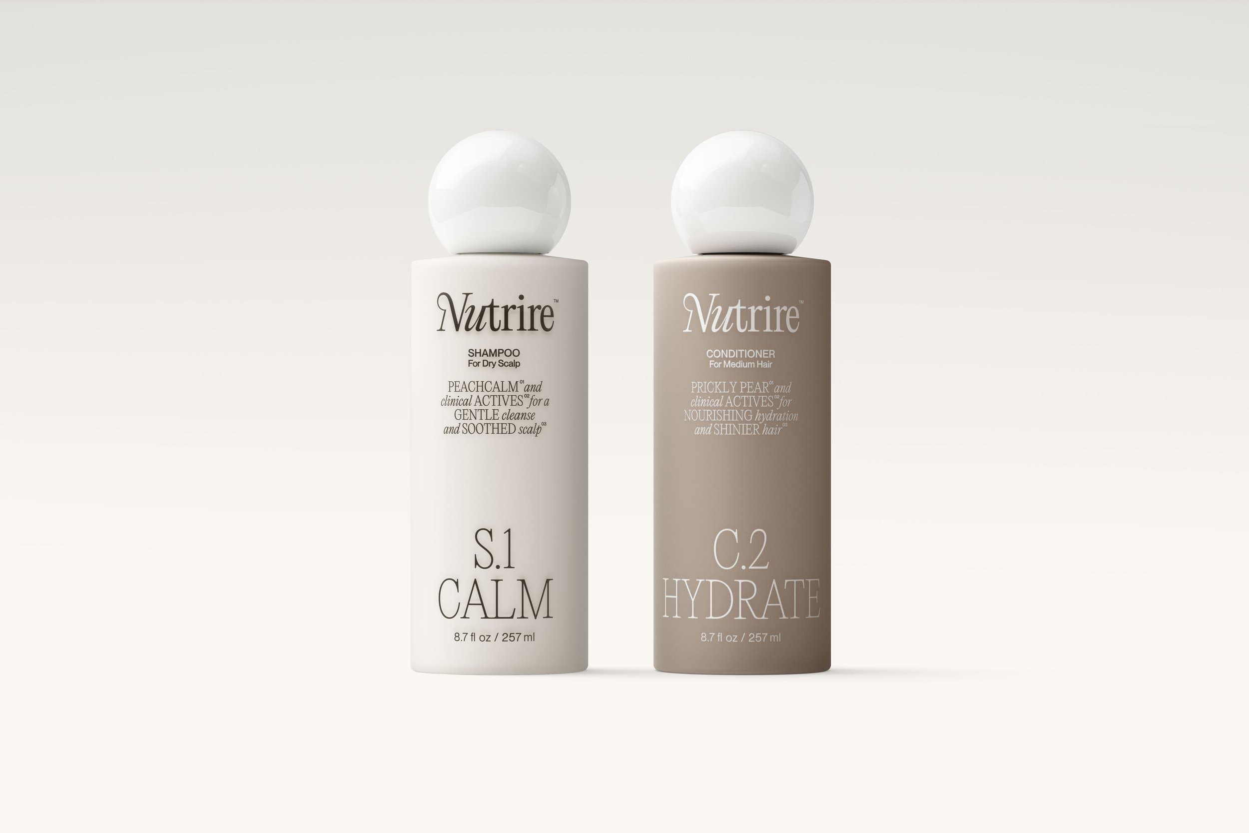
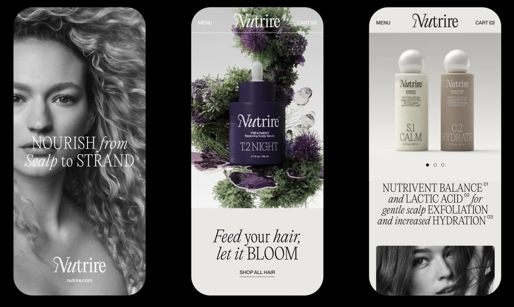
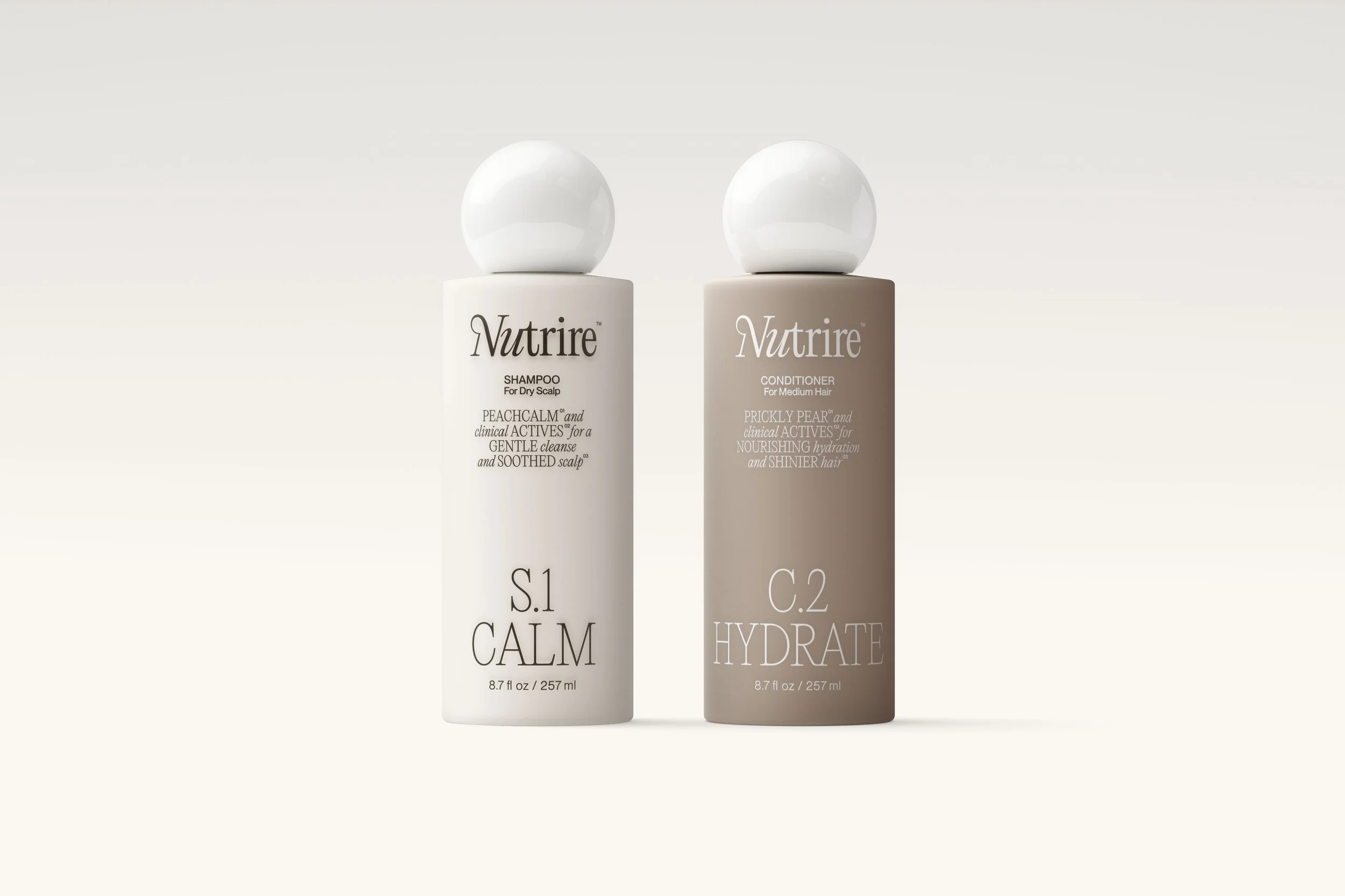
Nutrire is a line of haircare products founded on the principle that healthier hair begins with a nourished scalp. Crafted by Chicago-based powerhouse Mario Tricoci, it offers a highly tailored routine targeting both skin and hair needs. Shampoos address the scalp; conditioners tend to the strand.
I worked with the team at Established to build Nutrire from the ground up. We started with creative concepts, ultimately balancing the formulas’ technical precision with romance through a territory we called “Garden Rhapsody.” My work included product naming, packaging copy, and key messaging for launch, plus a light touch on tone of voice for brand guidelines.
Established’s work on Nutrire received a Gold Pentaward; see more here.
- Role:
- Concepts, Naming, Copy
- Agency:
- Established
RUX
RUX, formerly Open Door Technology, builds enterprise resource planning (ERP) software systems for construction and equipment rental businesses.
- Naming
- verbal identity
- site copy
- brand story
- messaging
- brand guidelines
See projectClose

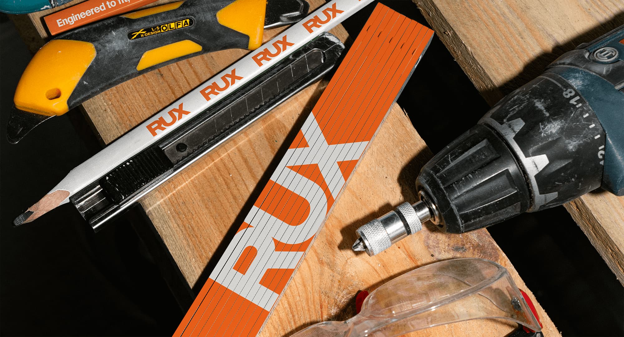
RUX, formerly Open Door Technology, builds enterprise resource planning (ERP) software systems for construction and equipment rental businesses. Unlike competitors with one-size-fits-all solutions, RUX tailors and unites business applications to create flexible systems with serious longevity. It came to design studio Company Policy for a full rebrand, including naming, strategy, and design, aiming to stand out as the clear leader in a crowded yet aesthetically homogeneous space.
I crafted a confident tone of voice for RUX, leaning into declarative messaging and a feeling of earned sturdiness, and solidified short and long versions of the brand’s narrative. I translated this work into copy for the new RUX site, which the talented crew at Company Policy also designed. You can see more from the studio here.
- Role:
- Naming, Copy
- Studio:
- Company Policy
Fulton
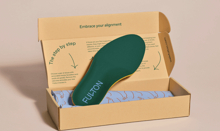
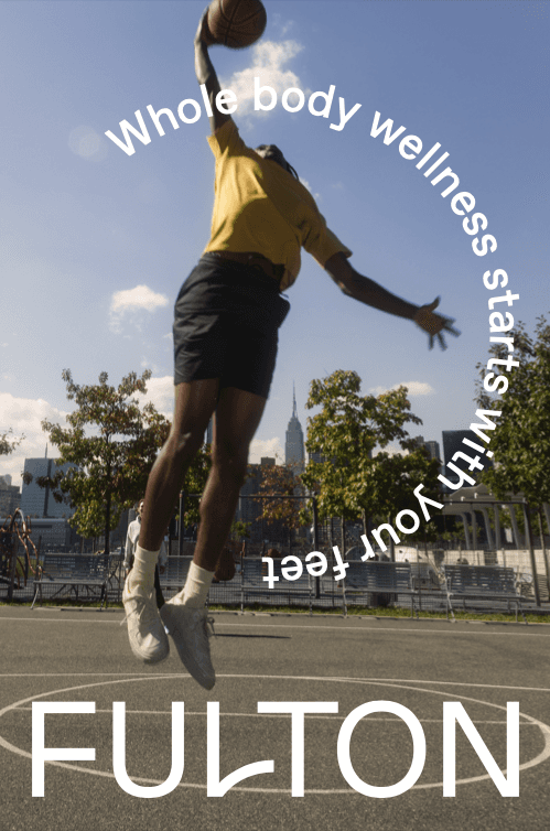
Fulton designs sustainable modern cork insoles.
- Verbal identity
- messaging
- brand story
- blogs
- packaging
- site copy
See projectClose

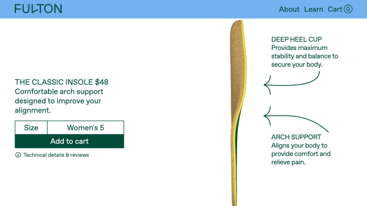
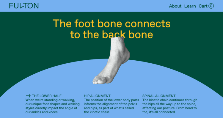
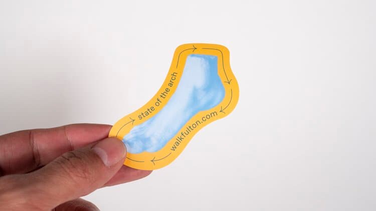
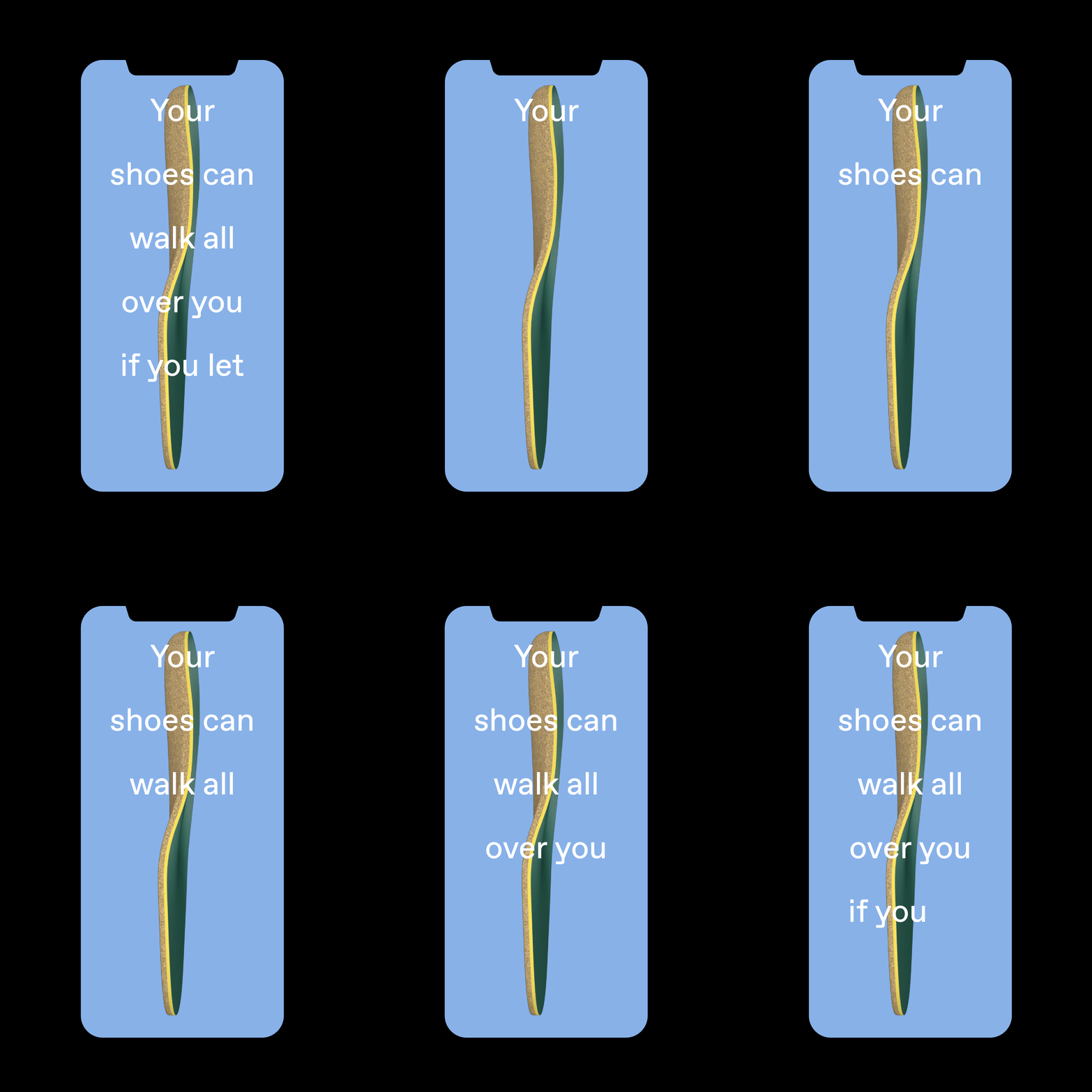
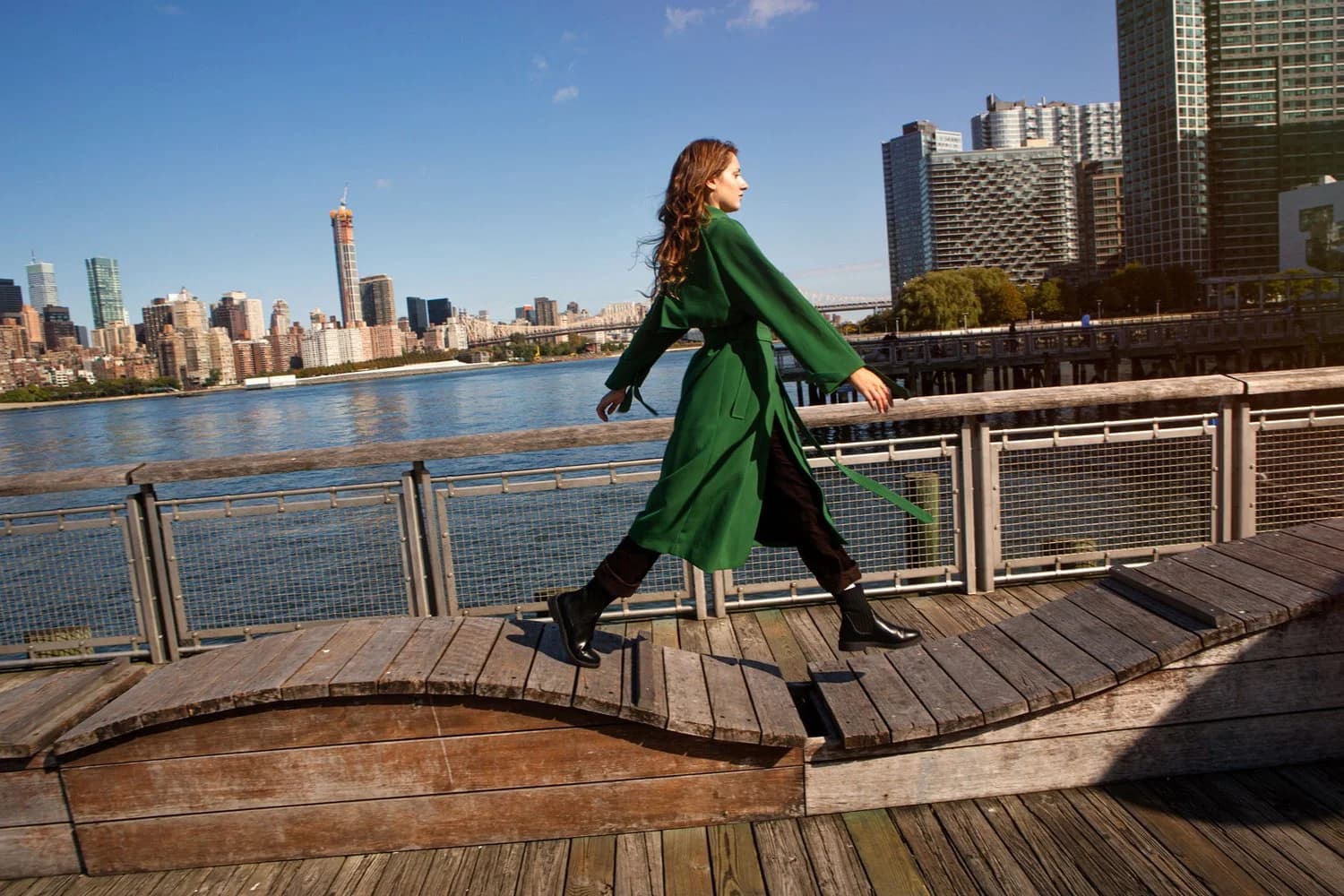
Fulton designs sustainable modern cork insoles. It was founded to help people take control of their alignment from the ground up, mitigating the impact of unsupportive shoes and natural variations of the foot. The brand partnered with Formal Studio to create its identity from scratch: everything from strategic foundations to a brand new site.
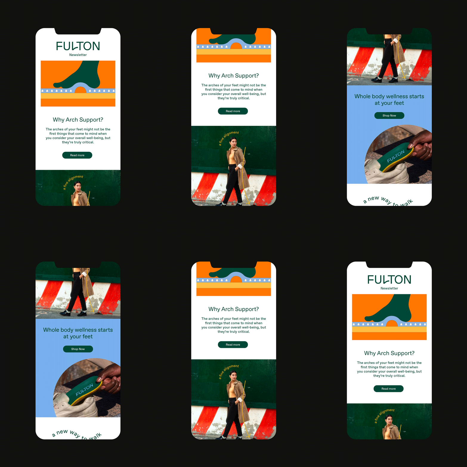
Our work started with the insight that arch support should be a proactive step toward full-body wellness, positioning Fulton as a daily essential for active people—“a better way to walk.” From there, I developed Fulton’s story, key messaging, and a relatable, optimistic voice. I also wrote site, packaging, and blog copy for Fulton’s launch. Custom arch support was always comfortable and cushy. Now it’s cool.
- Role:
- Copy, Strategy
- Studio:
- Formal Studio
- Team:
- Web design: No Ideas
EEZ Co.
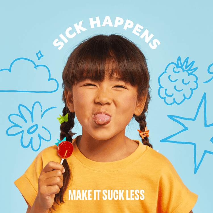
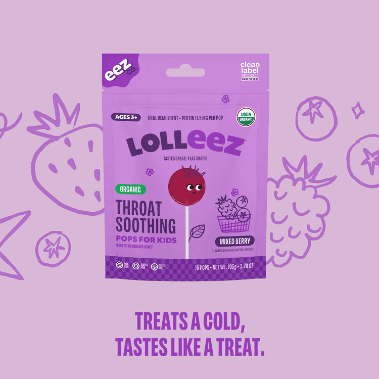
EEZ Co. are suckers for less-sucky sick days: lollipops and drops with organic ingredients to remedy coughs, sniffles, and more.
- Verbal identity
- brand story
- messaging
See projectClose
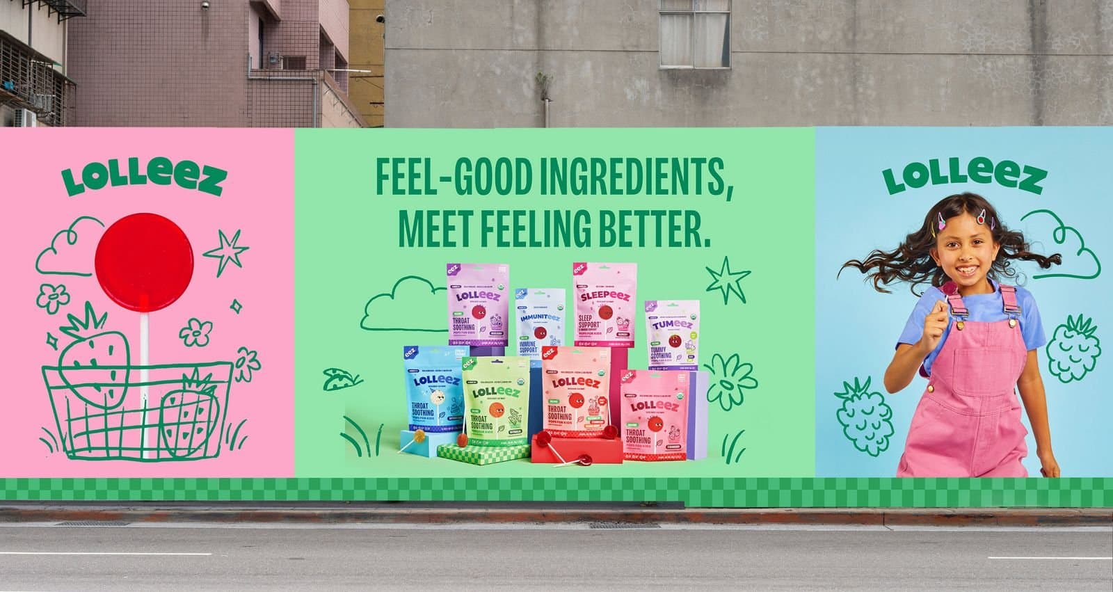
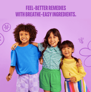
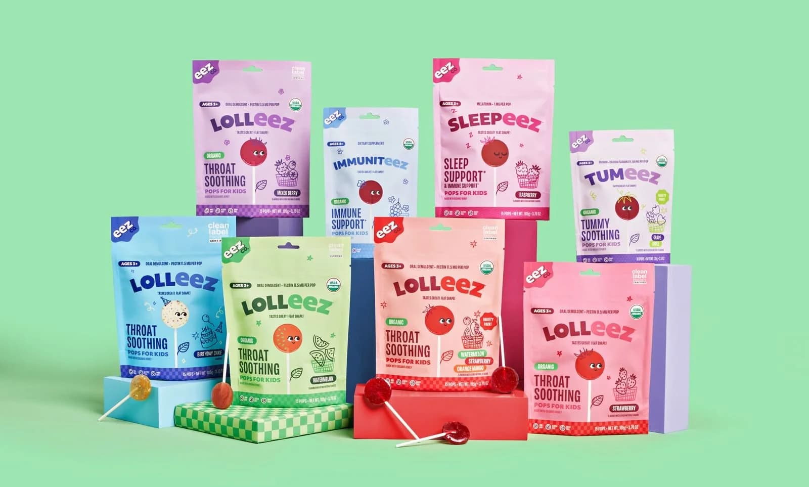
EEZ Co. are suckers for less-sucky sick days: lollipops and drops with organic ingredients to remedy coughs, sniffles, and more. Originally called “Momeez Choice,” the brand came to Brains for a full rebrand to propel it from a word-of-mouth favorite (already available in 35k+ stores!) to a family wellness leader. It needed a new name, a snappier voice, and updated messaging to match a fresher poppier look.
I worked with the Brains team to define how EEZ Co. sounds, articulate its mission and story, and create a bank of headlines to inspire web and social copy. With plenty of room to play, we landed on a precocious, lighthearted tone of voice to support parents on those particularly tough days and make it all just a touch… easier.
For more, Brains has a full overview of the project here. The Dieline also covered the rebrand, which earned a Silver Dieline Award for brand identity system.
- Role:
- Copy
- Agency:
- Brains
- Team:
- Copywriter: Anusha Bansal

doublesoul
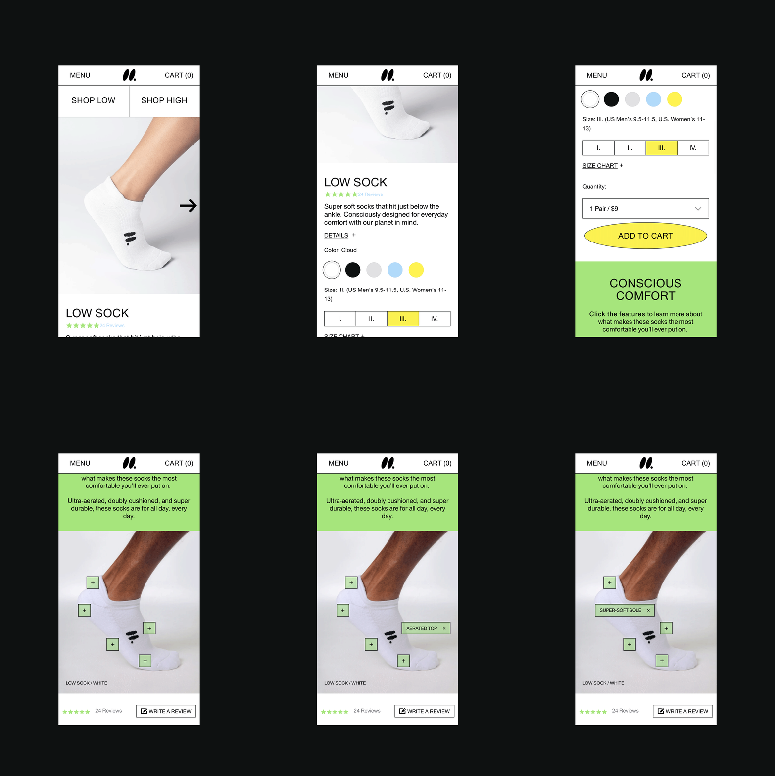
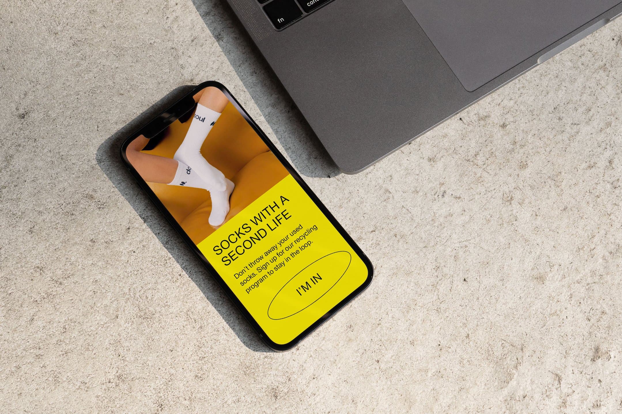
Here to clean up the world’s sock drawers, doublesoul designs ultra-cushioned socks, made sustainably.
- Verbal identity
- brand story
- packaging
- site copy
See projectClose

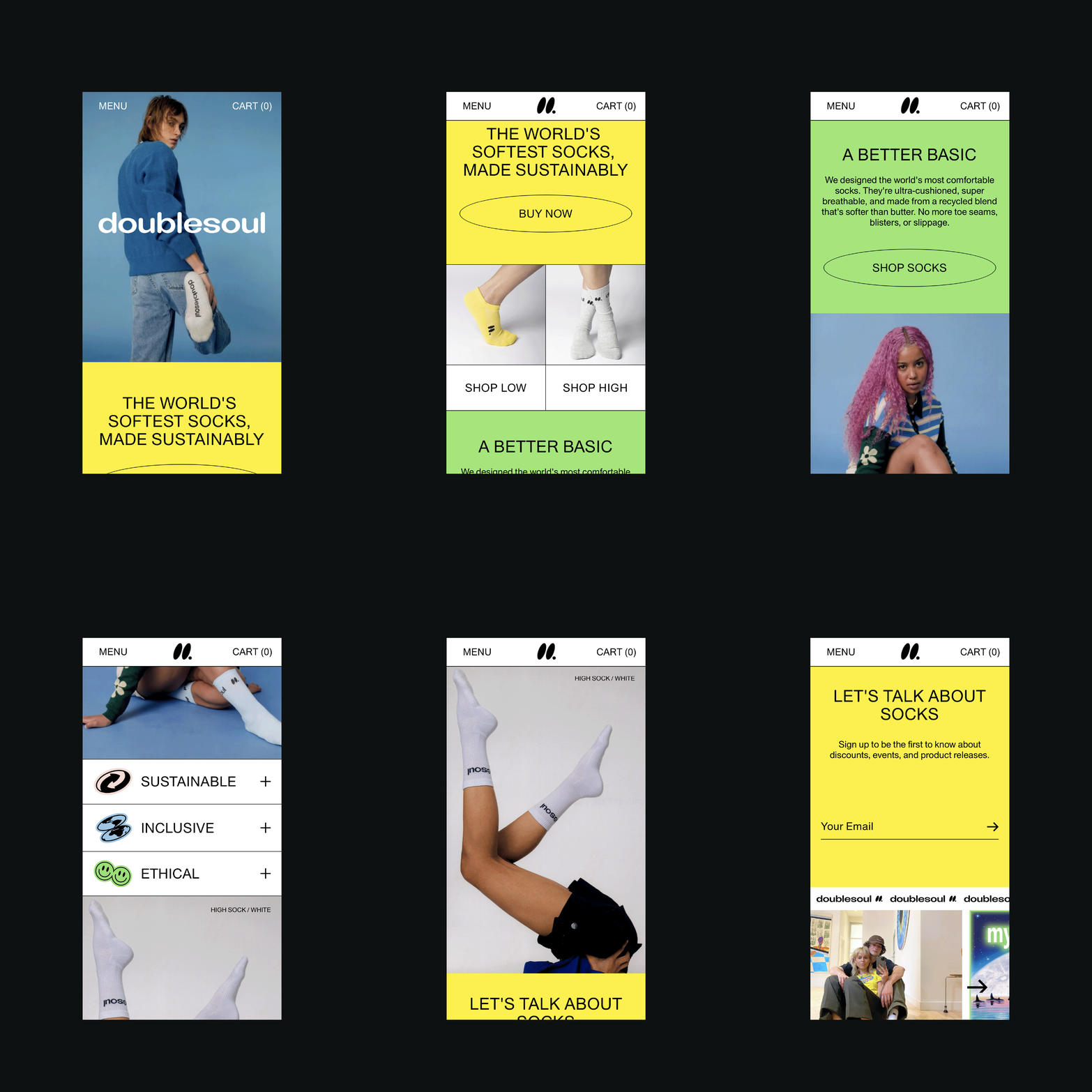
Here to clean up the world’s sock drawers, doublesoul designs ultra-cushioned socks, made sustainably. As a new brand breaking into a category that’s easy to overlook, doublesoul wanted to get people thinking about what’s going on underfoot and in the world.
I worked with Formal Studio to put words to the brand’s foundations and story, followed by messaging and guidelines for a casual, clear voice. Then it was on to site and packaging copy to pair with doublesoul’s bright, lo-fi visual system. When it comes to your socks, it’s easier than ever to tread (super) softly.
- Role:
- Copy
- Studio:
- Formal Studio
- Team:
- Web design: Lisa Meyer
Respin Health
Founded by actress Halle Berry, Respin Health is a community-based digital platform conceived as a thoughtful, empowering response to the confusion, fear, and loneliness so many women still face as they enter menopause.
- Creative concepts
- brand positioning
- manifesto
- verbal identity
- messaging
- site copy
See projectClose
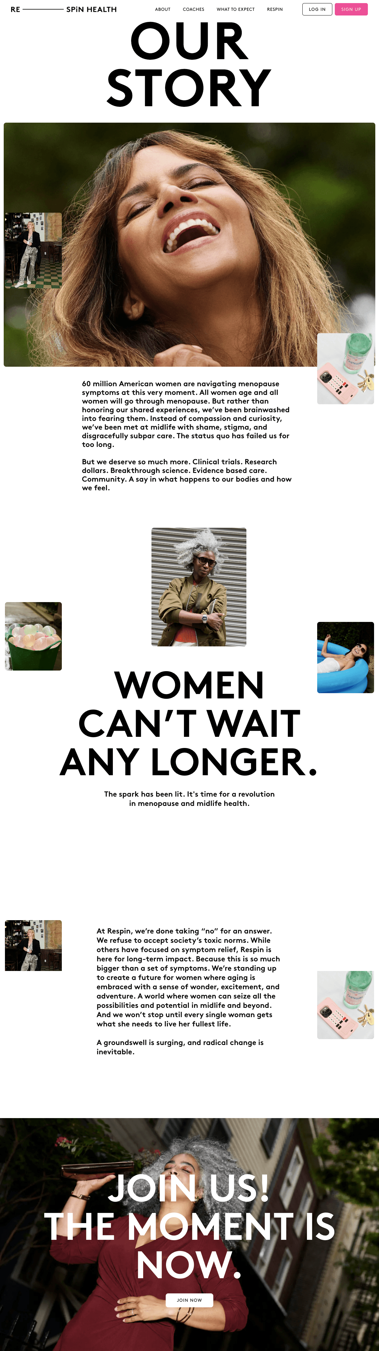
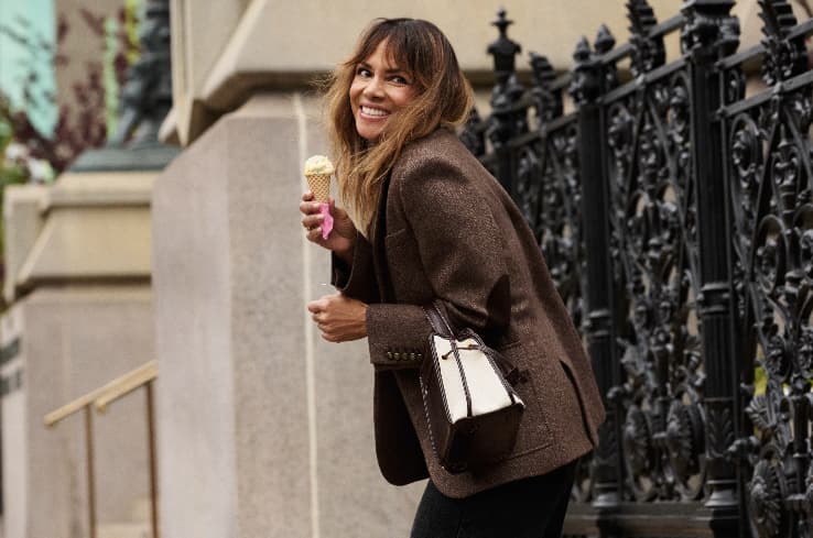
Founded by actress Halle Berry, Respin Health is a community-based digital platform conceived as a thoughtful, empowering response to the confusion, fear, and loneliness so many women still face as they enter menopause. Designed for every phase of menopause, it offers tailored coaching from vetted and credentialed experts.
Creative agency Established developed every aspect of the brand; I joined for strategy and copy. I started by auditing the (now-booming) menopause space to understand the key players and how they speak, and where Respin Health fits. From there, I worked on the foundational brand pieces: articulating positioning and creative territories and creating verbal guidelines, manifesto, and key messaging. Respin Health’s launch was covered by outlets like Women’s Health, TODAY, and WWD. You can view more of the Respin identity work from Established here.
- Role:
- Strategy, Copy
- Agency:
- Established

Dame
A courageous trailblazer in the world of sexual wellness, Dame thoughtfully designs vibrators and other products to encourage experimentation and play.
- Verbal identity
- naming
- newsletters
- packaging
- site copy
- social
See projectClose
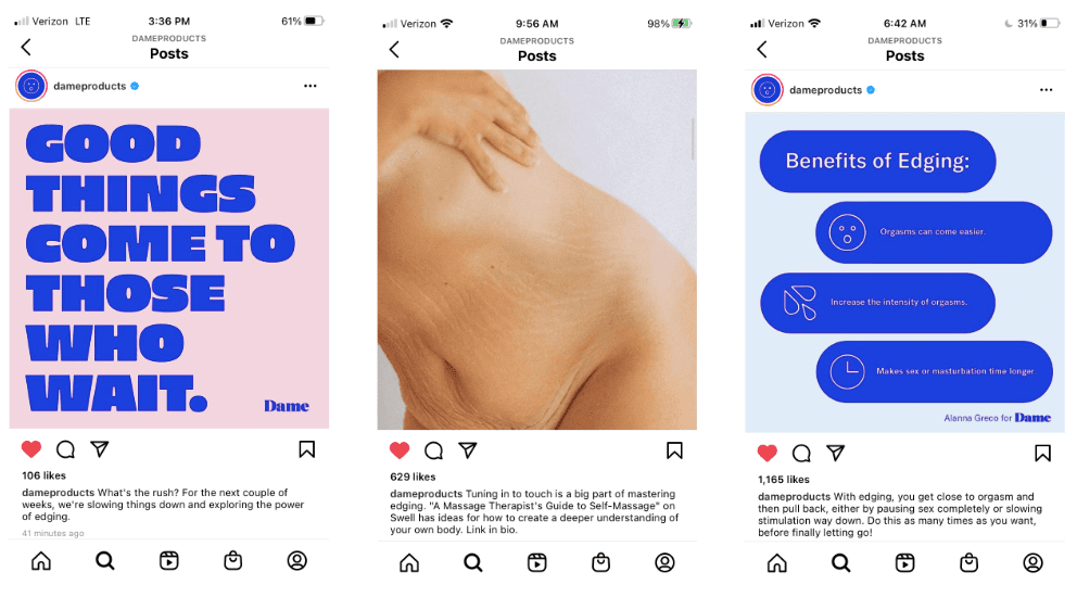
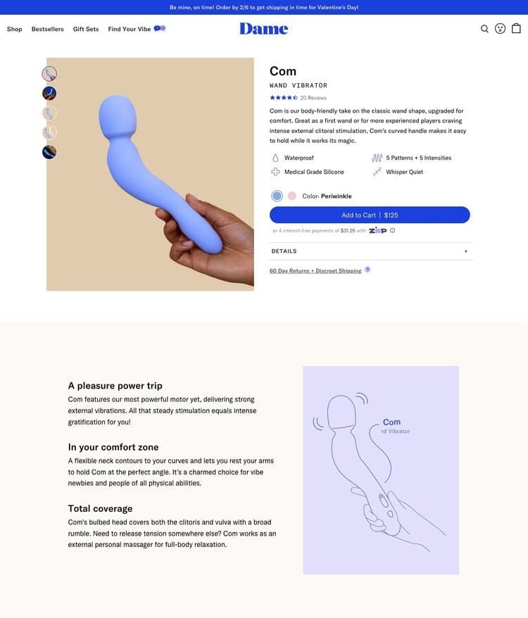
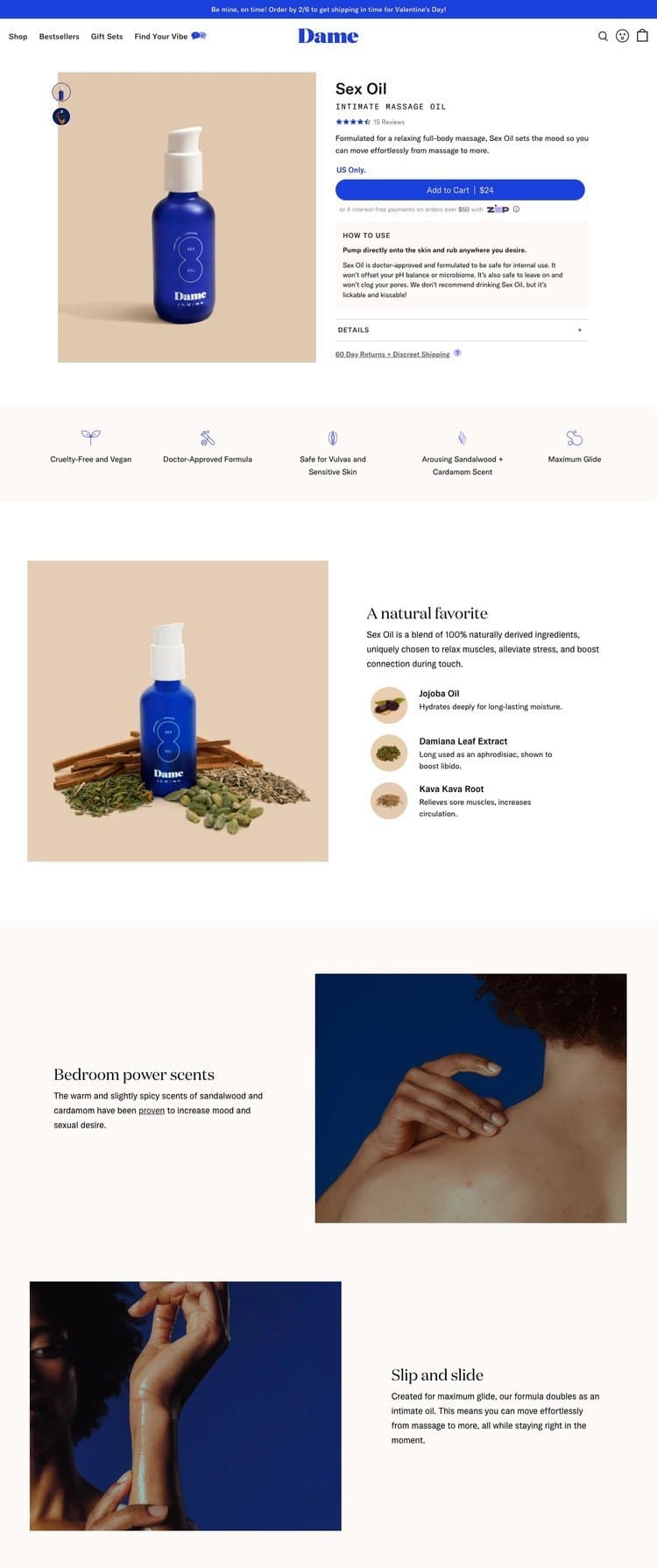
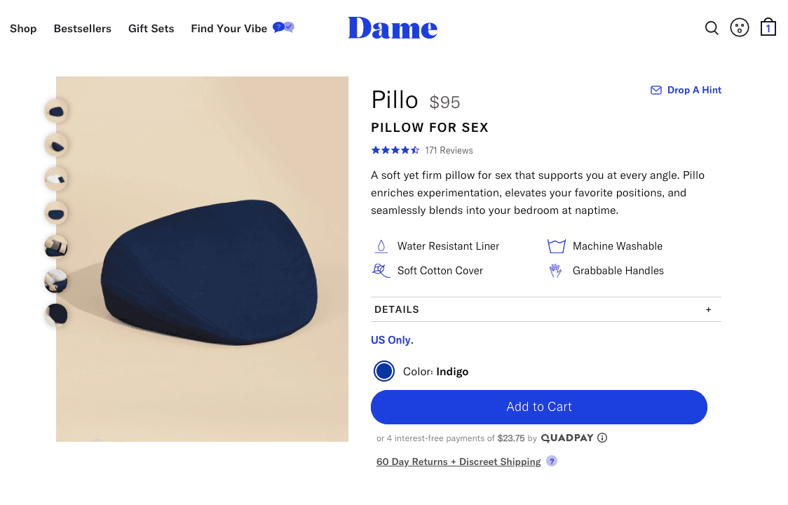
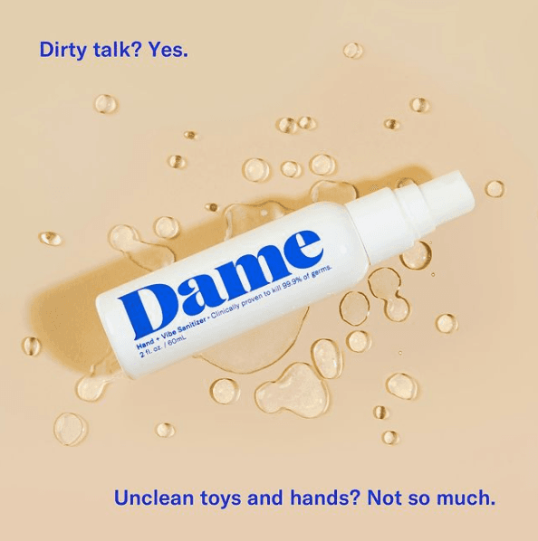
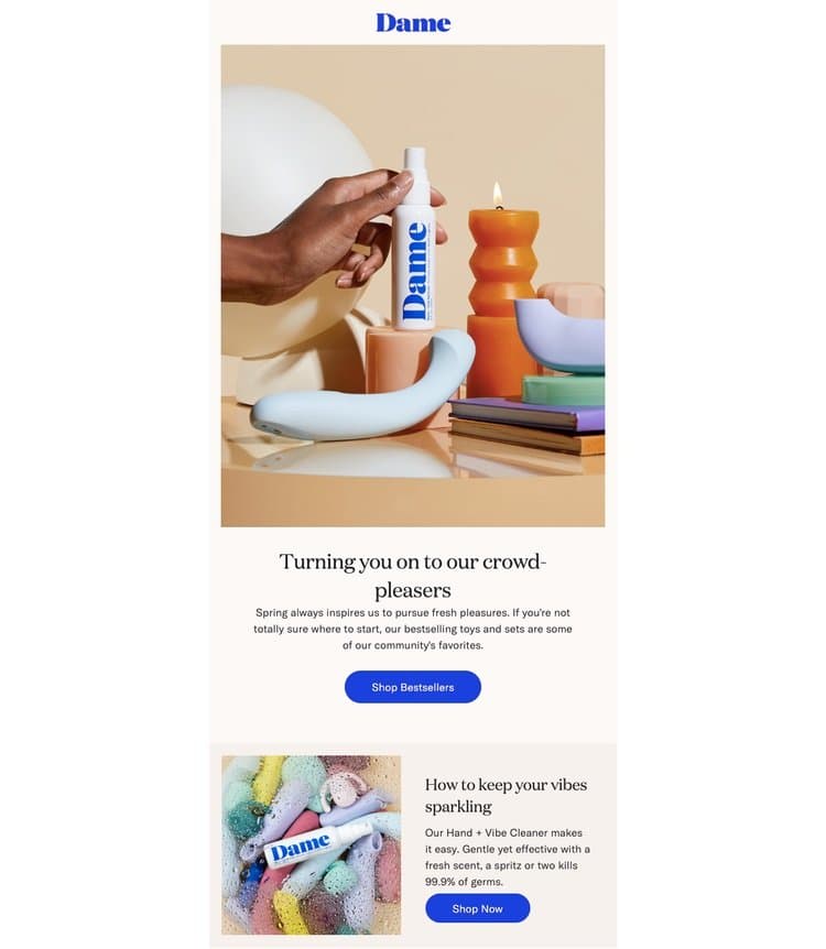
A courageous trailblazer in the world of sexual wellness, Dame thoughtfully designs vibrators and other products to encourage experimentation and play. It originally launched with a mission of closing the pleasure gap and has since gone on to make headlines as an unapologetic proponent of pleasure for all.
In 2020, I collaborated with a creative team to refresh and evolve Dame’s visual and verbal identity, inspired by a new strategic proposition: pleasure is health. I created new guidelines to elevate Dame’s voice. This work led to two years as Dame’s go-to resource for campaigns, newsletters, social, packaging, naming, and site copy.
- Role:
- Naming, Copy
- Studio:
- Formal Studio
- Team:
- Brand refresh strategy: Gilian Rappaport

Little Spoon
Made for the modern parent—and their kids—Little Spoon creates childhood nutrition that’s tailored to developmental stages.
- Naming
- messaging
- packaging
- site copy
See projectClose
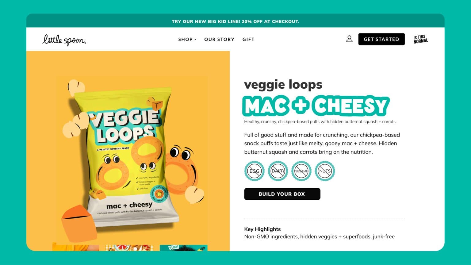
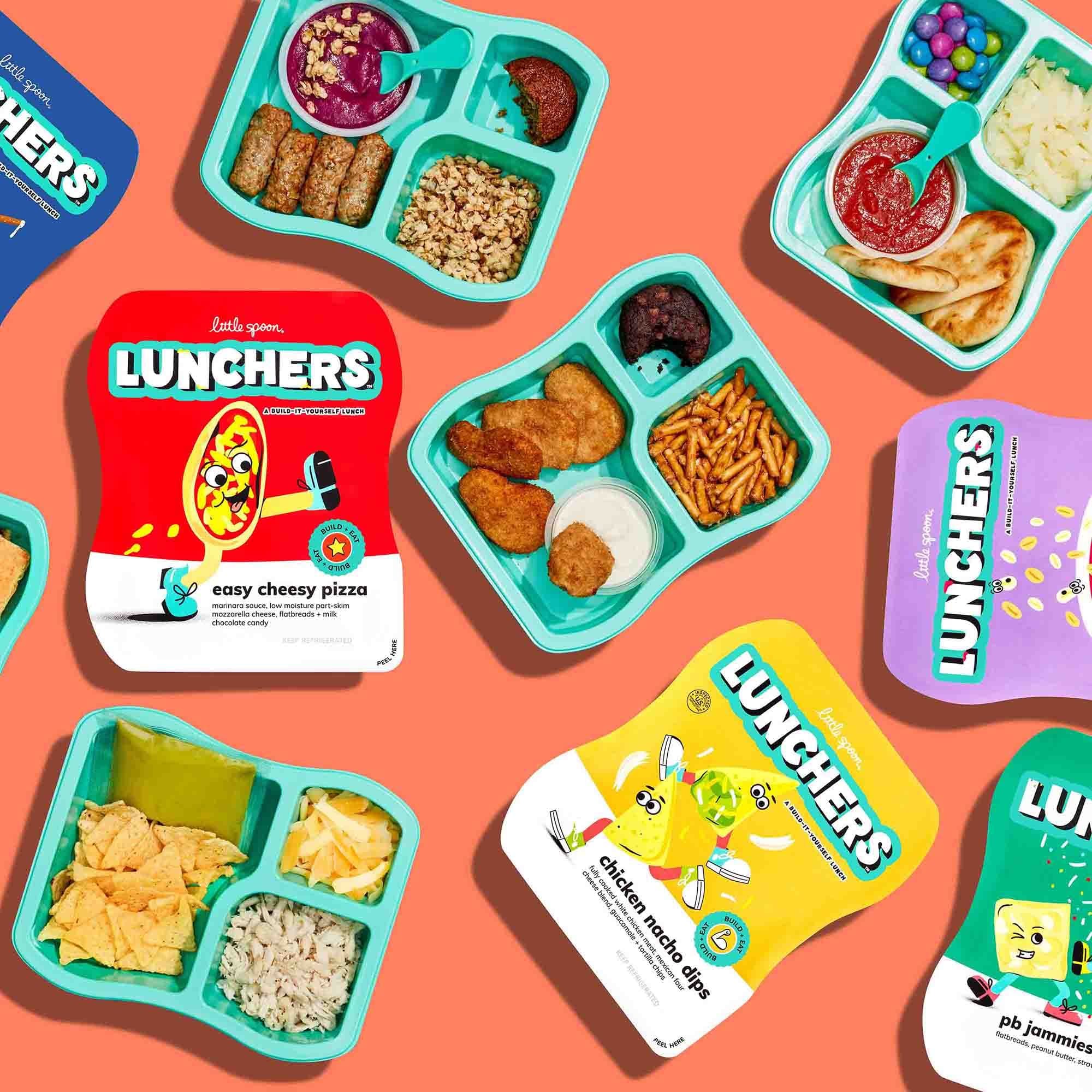
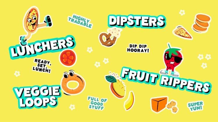
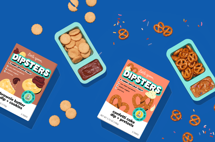
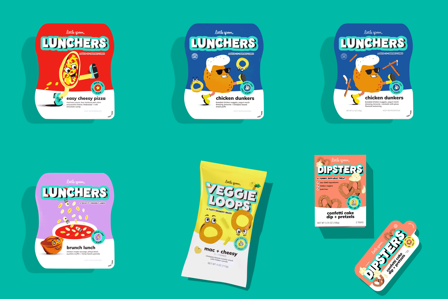
Made for the modern parent—and their kids—Little Spoon creates childhood nutrition that’s tailored to developmental stages. As the brand expanded into lunches and snacks for the 4- to 7-year-old set, it tapped NYC agency Smakk Studios to “age up” its packaging and copy to match.
I collaborated with Smakk’s strategy and design team to launch junk-free products that are credible enough for parents to trust and cool enough for kids to show off in the lunchroom. I named products and flavors (making sure they were as fun to say as they are to eat) and wrote pack and site copy.
Per The Dieline, the new product line “sets a new standard for kids' lunches and snacks, bridging old-school charm with modern, playful aesthetics.”
- Role:
- Naming, Copy
- Agency:
- SMAKK Studios
De Lune
De Lune is a pioneering company that offers research-backed, natural relief of period symptoms and menstrual health resources.
- Verbal identity
- brand story
- product naming
- packaging
- site copy
See projectClose

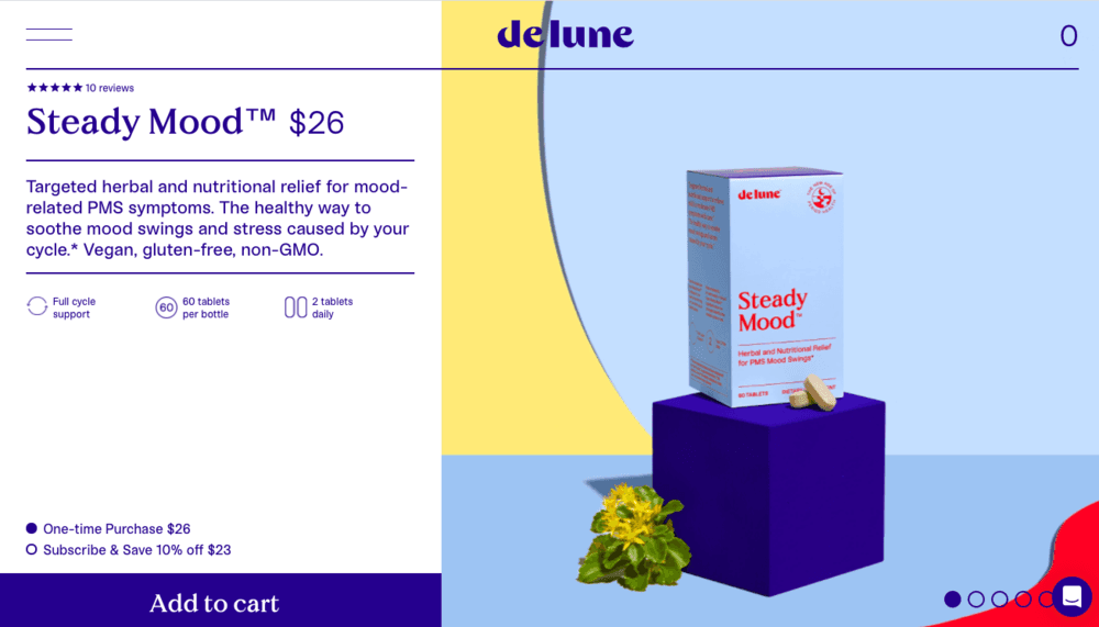
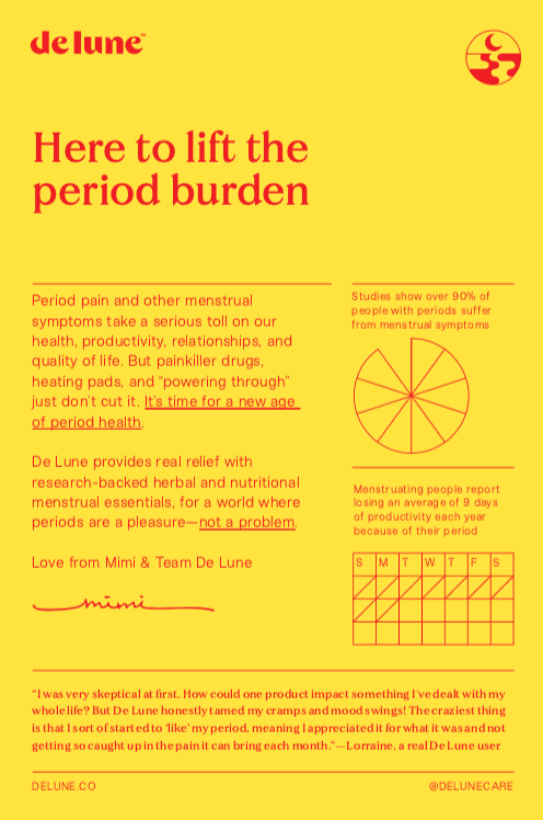
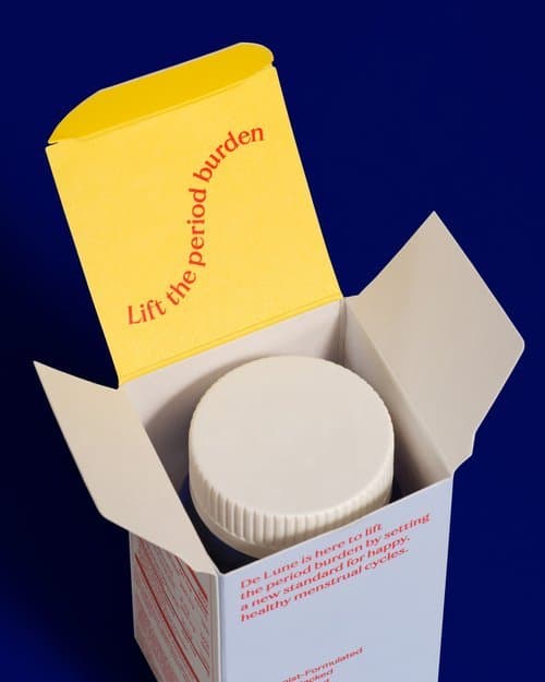
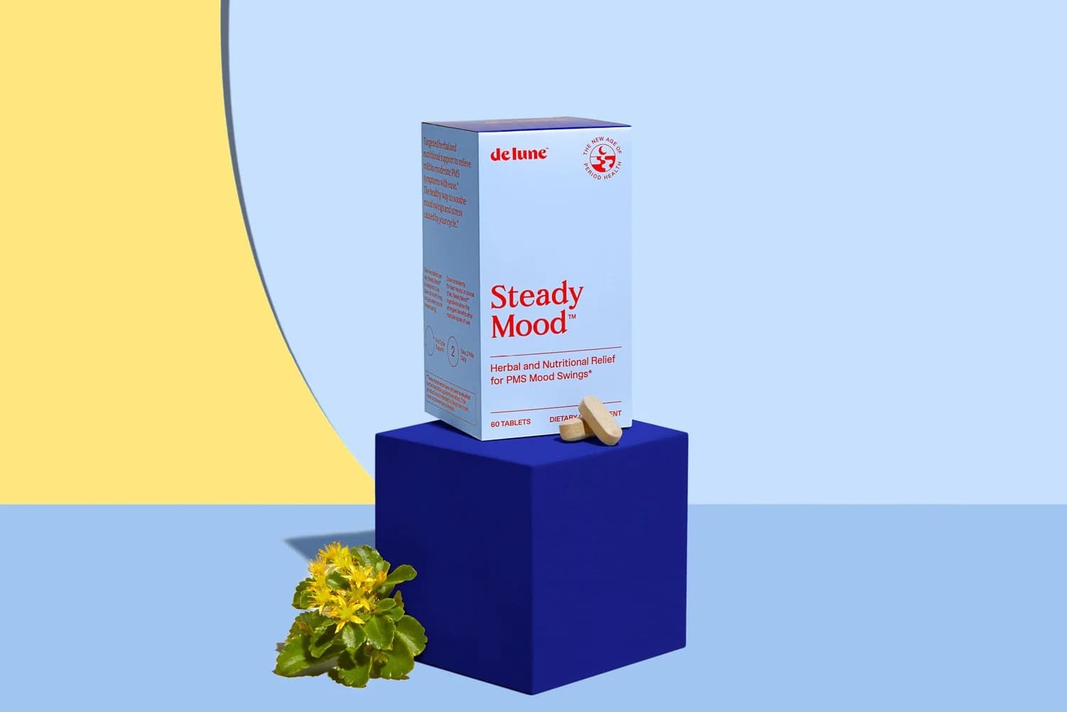
De Lune is a pioneering company that offers research-backed, natural relief of period symptoms and menstrual health resources. They’re actively building a world where menstruation and period symptoms are no longer taboo. I worked with a strategic and creative team to refresh De Lune’s brand system, including a new tone of voice, site copy, and product naming. The result was an approachable yet sophisticated identity to take this groundbreaking brand into the new age of period health.
- Role:
- Naming, Copy
- Studio:
- Formal Studio
- Team:
- Strategy: Gilian Rappaport
- Web design: No Ideas
Fair Harbor
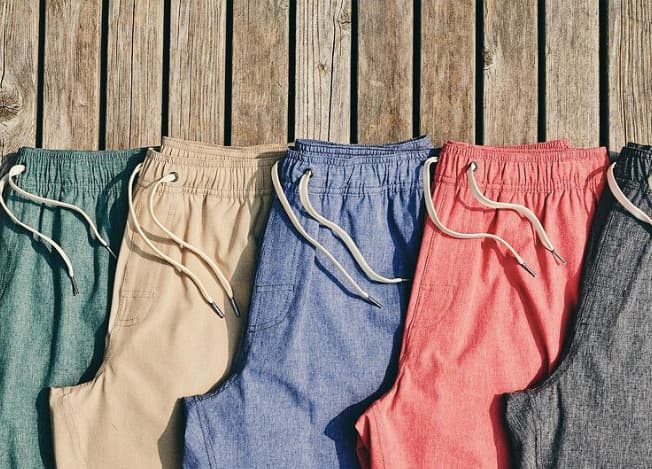
Inspired by the laid-back barefoot Long Island community of the same name, Fair Harbor creates innovative, ultra-comfortable apparel made from upcycled plastic bottles, designed for the beach and beyond.
- Verbal identity
- brand story
- catalog
- site copy
See projectClose
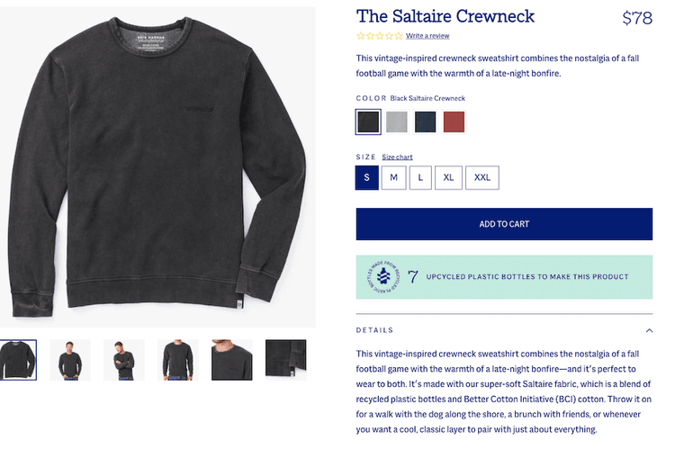
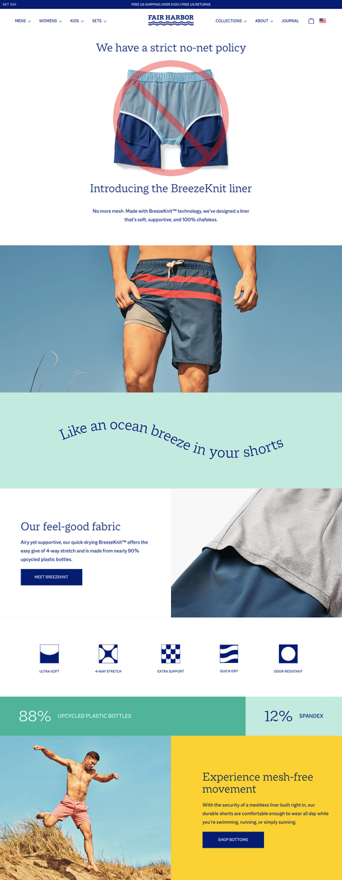
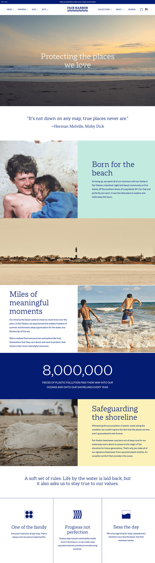
Inspired by the laid-back barefoot Long Island community of the same name, Fair Harbor creates innovative, ultra-comfortable apparel made from upcycled plastic bottles, designed for the beach and beyond. A strong sense of place pervades the entire brand. It’s at once nostalgic and hopeful, working to safeguard the future so everyone can keep enjoying the places they love, too.
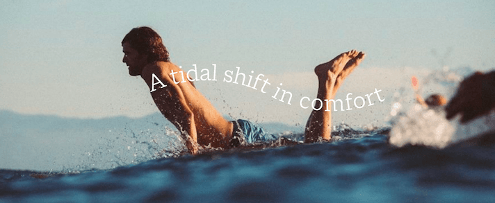
In collaboration with Formal Studio, I built a relaxed, inviting tone of voice and crafted site copy as part of a full brand refresh. Fair Harbor’s signature mesh-free lining frees people to go about their days in total comfort, and the new branding embodies salt-kissed ease. After the brand work, I also partnered directly with Fair Harbor for several months on site copy, campaign landing pages, and catalog copy.
- Role:
- Copy
- Studio:
- Formal Studio

Wilderness Trail
Founded by two ex-bandmates known as “the science guys of bourbon,” Wilderness Trail is a small-batch whiskey company that combines time-honored distilling techniques with cutting-edge science to create seriously special bourbons and ryes.
- Site copy
- brand story
- blog posts
See projectClose
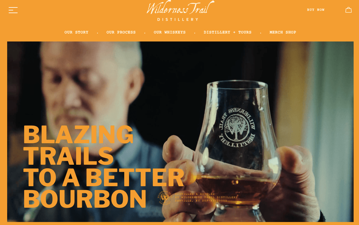
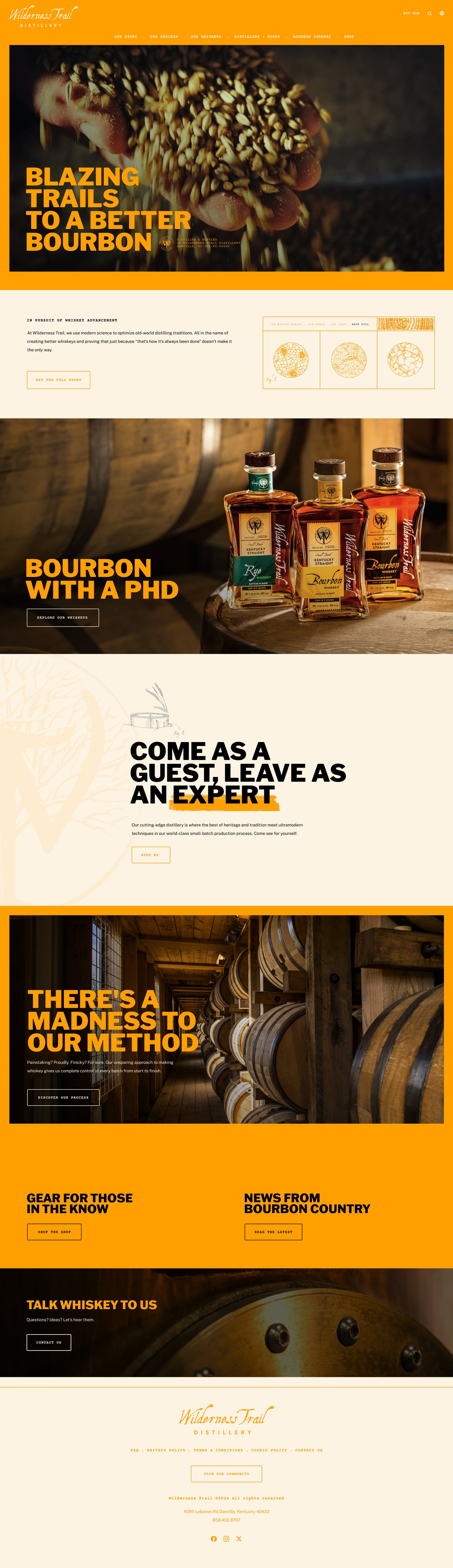
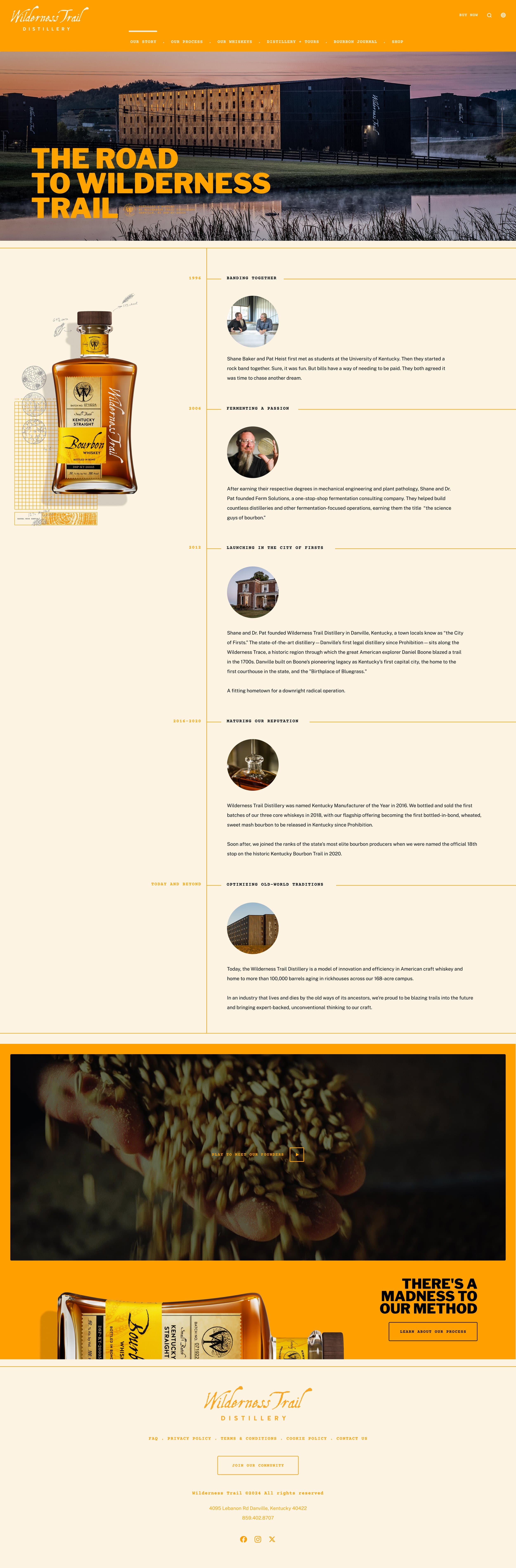
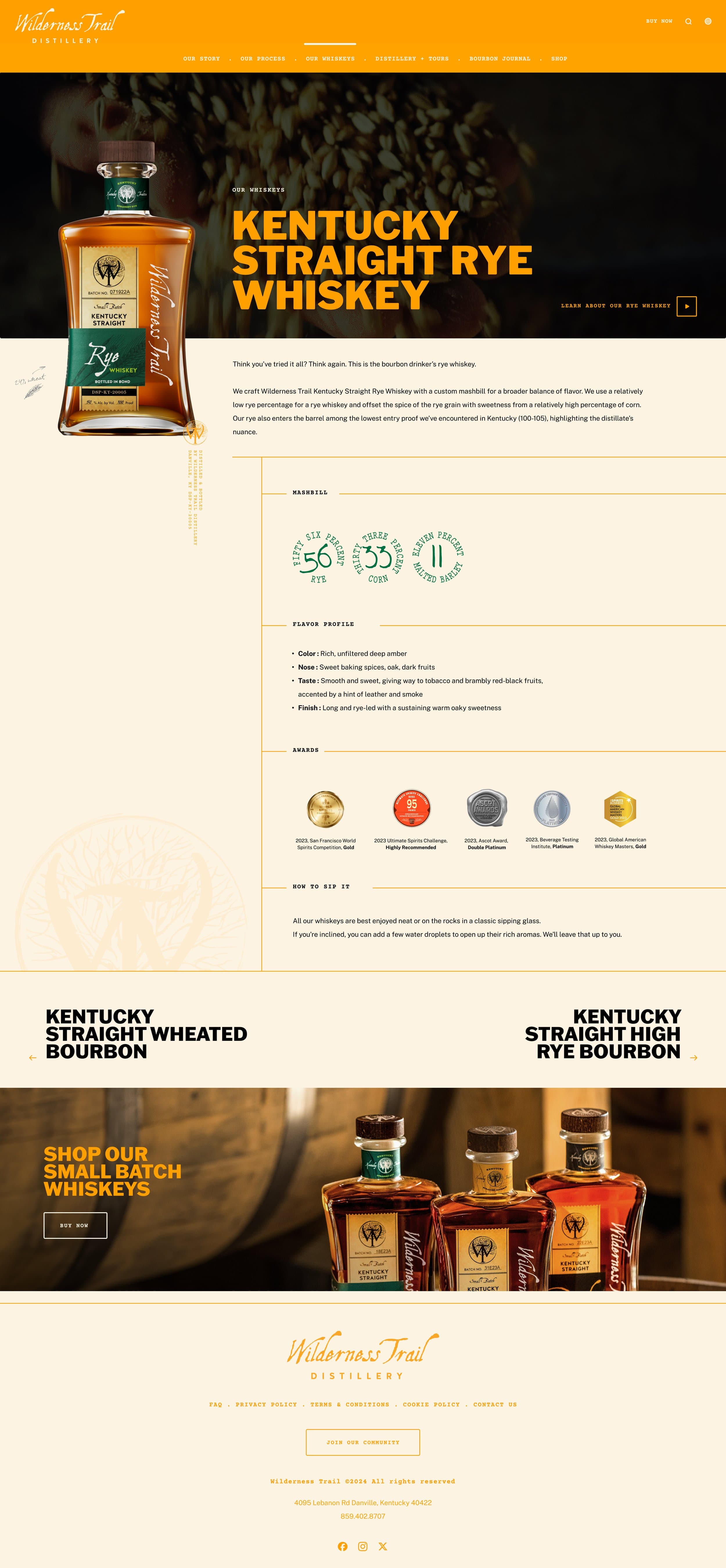
Founded by two ex-bandmates known as “the science guys of bourbon,” Wilderness Trail is a small-batch whiskey company that combines time-honored distilling techniques with cutting-edge science to create seriously special bourbons and ryes.
Now part of the Campari portfolio, Wilderness Trail needed a comprehensive new site to complement a recent identity refresh and a clear, cohesive story to entice and educate discerning drinkers. The big challenge was conveying the founders’ intense focus on craft, fermentation science, and the finer details without overwhelming the reader with TMI. I created site copy across all key pages and researched and wrote several blog posts investigating the brand’s history, its unique position in the wider whiskey world, and why rye is giving bourbon a run for its money.
- Role:
- Copy
- Agency:
- DEBRAIN

Burt's Bees
Burt’s Bees has long held a special place for those who remember tucking its yellow lip balm tins into their jean pockets.
- Verbal identity
- site copy
- emails
- messaging
See projectClose
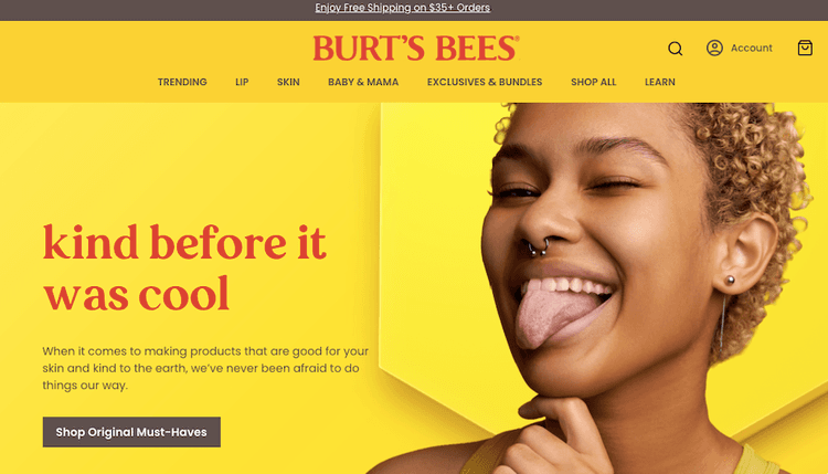
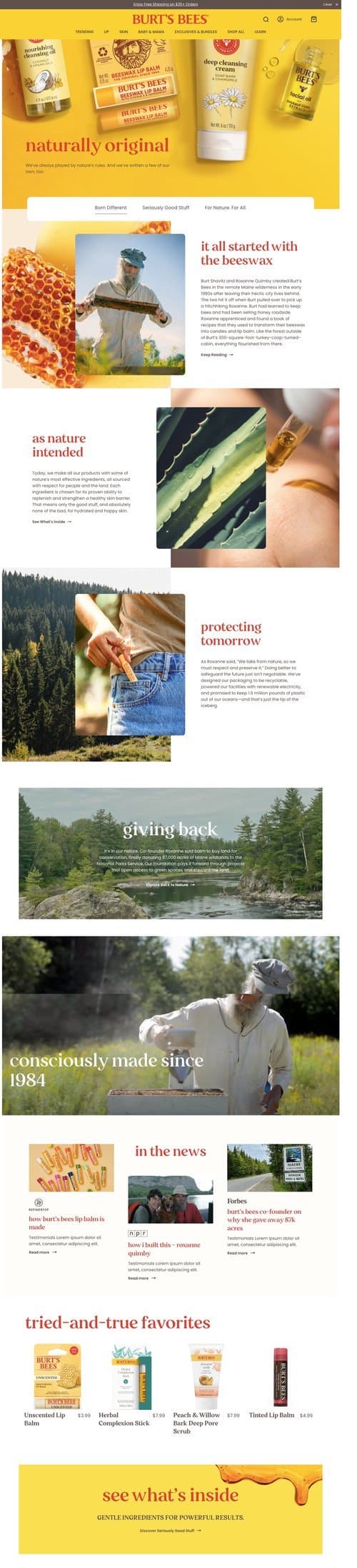
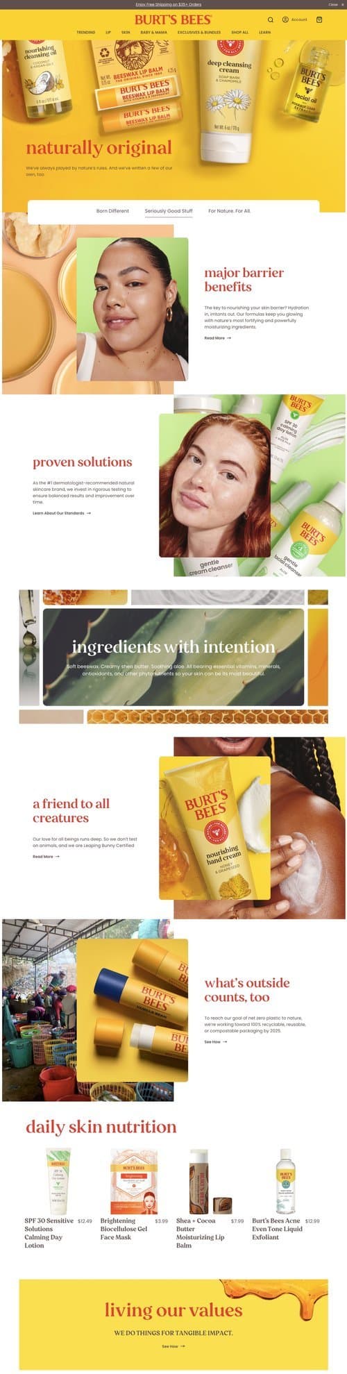
Burt’s Bees has long held a special place for those who remember tucking its yellow lip balm tins into their jean pockets. Founded over four decades ago by a pair of iconoclastic friends, the brand has always lived its mission of doing things better for people and the planet. Now it wanted to reach a new generation of conscious consumers and communicate the brand’s heritage and values in a more relatable, modern way. It tapped SMAKK Studios to give its site and digital voice a full makeover.
Along with copy for the redesigned site—including homepage, about us, product pages, and campaign landing pages—I created guidelines for how to write for web, social, newsletters, and SMS. This work freed the brand to be more energized and more fun everywhere it reached customers online. I also wrote welcome, transactional, and win-back emails that launched with the new site in 2023.
- Role:
- Copy
- Agency:
- SMAKK Studios
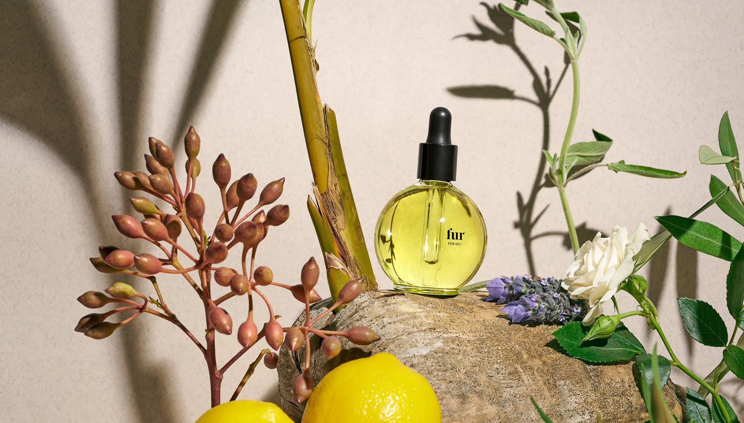
Fur
Fur is the first beauty brand dedicated to clean body hair care and head-to-toe soothing and smoothing for every part of the body—for everybody.
- Packaging
- site copy
See projectClose
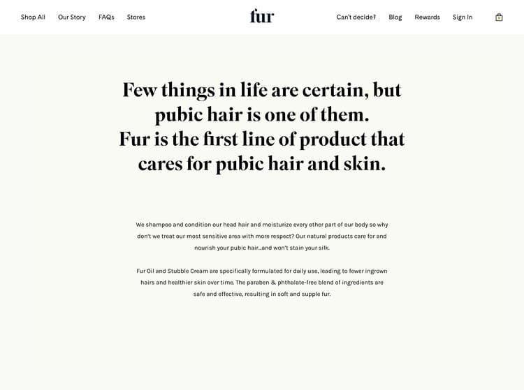
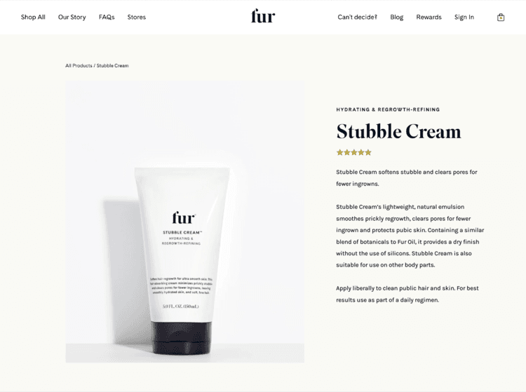
Fur is the first beauty brand dedicated to clean body hair care and head-to-toe soothing and smoothing for every part of the body—for everybody.
When Fur launched, I wrote homepage copy, product descriptions, and packaging copy, all to convey the brand’s open-minded and thoughtful approach to self care and body hair acceptance.
- Role:
- Copy
- Studio:
- Formal Studio

Target: 20 Years of Design for All
Target has always rejected the notion that great design should only be accessible to the few.
- Articles
- headlines
- research
See projectClose

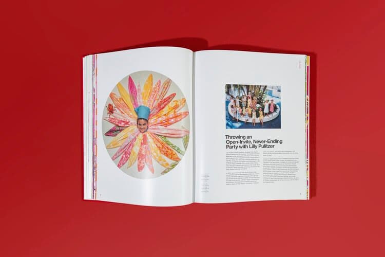
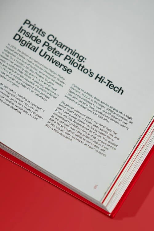
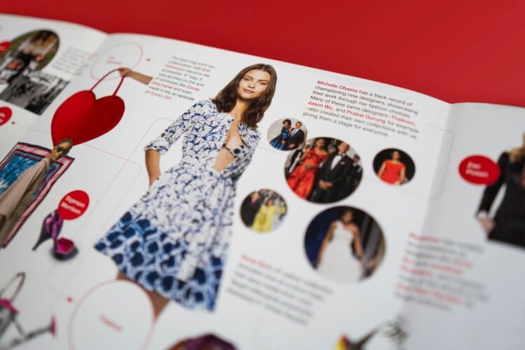
Target has always rejected the notion that great design should only be accessible to the few. This open-minded approach paved the way for 180+ partnerships with renowned designers like Missoni, Isaac Mizrahi, Philippe Starck, Alexander McQueen, Lilly Pulitzer, and many more.
I worked with the team at Chandelier Creative to research and write headlines and columns for Target: 20 Years of Design for All: How Target Revolutionized Accessible Design (Rizzoli), a book celebrating decades of these groundbreaking collaborations. The book is a beautiful design object in itself, with pages of colorful layouts, archival photographs, and interviews and stories.
- Role:
- Research, Copy
- Agency:
- Chandelier
- Team:
- Creative direction: Marian Shelley Acuña
- Editor: Laura Bannister

Pernod Ricard
Pernod Ricard is a global leader in wine and spirits, with a portfolio spanning some of the bar’s most iconic bottles: Absolut, Jameson, Malibu, Kahlua, and many others.
- Site copy
- blogs
- banner ads
- gift guides
- newsletters
- ads
- social
- scripts
- crosswords
See projectClose
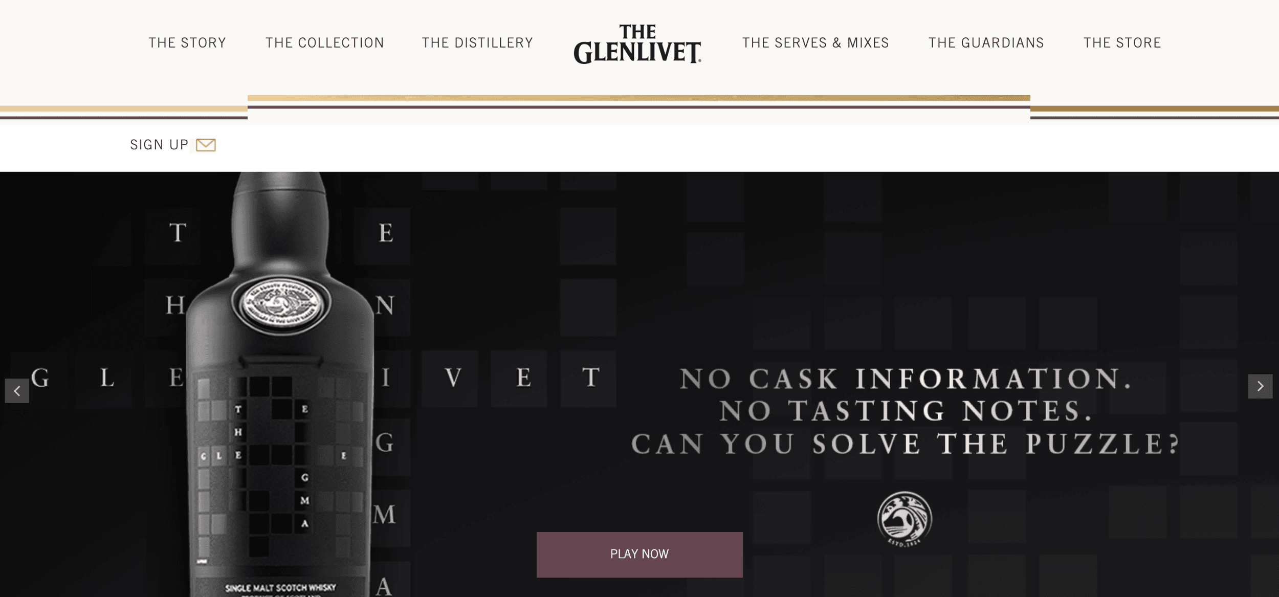
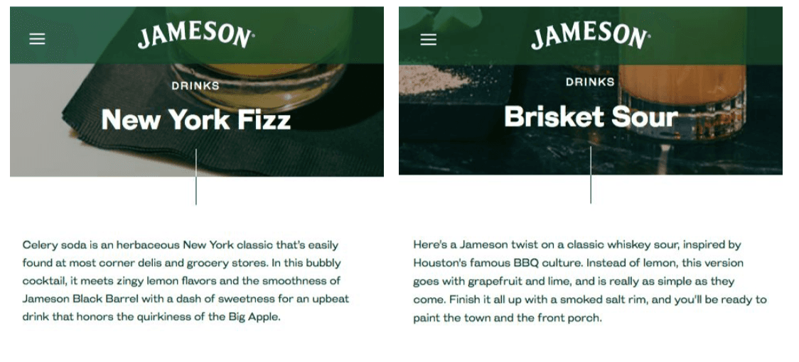
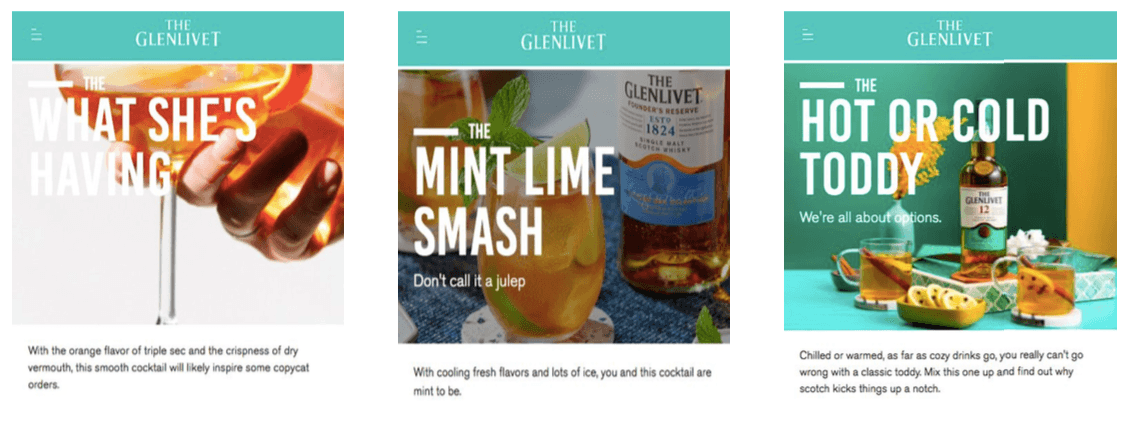
Pernod Ricard is a global leader in wine and spirits, with a portfolio spanning some of the bar’s most iconic bottles: Absolut, Jameson, Malibu, Kahlua, and many others.
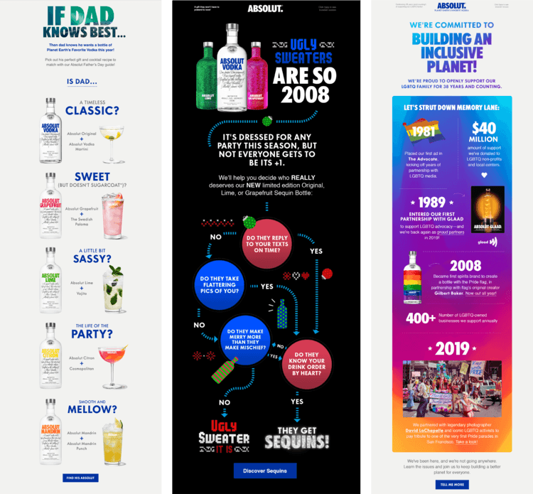
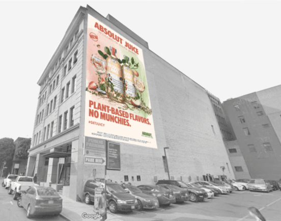
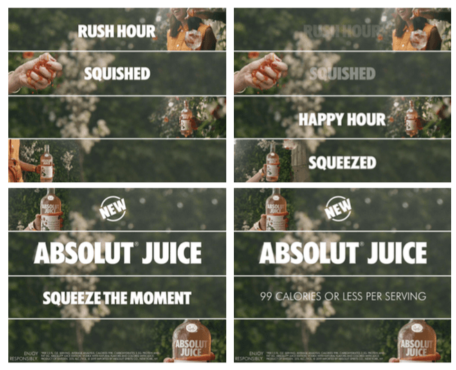
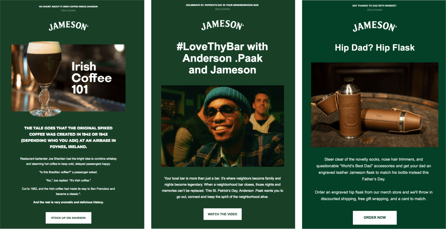
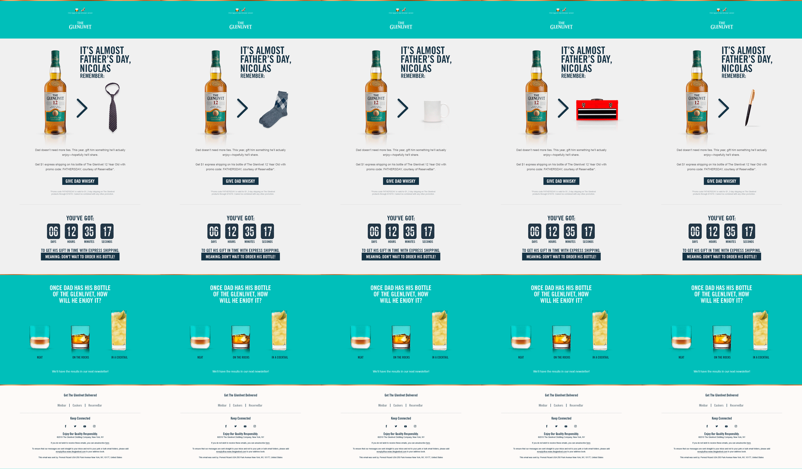
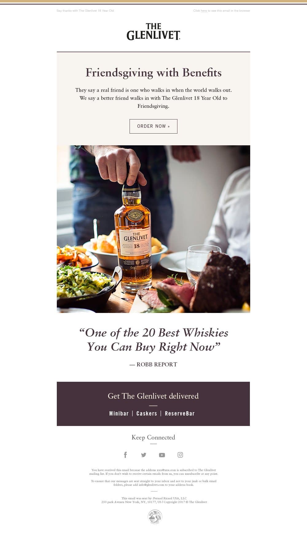
Working with DËBRAIN, Pernod’s digital AOR for several years, I wrote hundreds (I mean, hundreds) of newsletters across the company’s family of brands, plus countless campaign sites, gift guides, banner ads, digital billboards, social posts, video scripts—and even a series of crossword puzzles for The Glenlivet. Cheers.
Accounts: Aberlour, Absolut, Altos, Avion, Chivas Regal, Jameson, Kahlua, Malibu, Martell, Smithworks Vodka, The Glenlivet
- Role:
- Copy
- Agency:
- DEBRAÏN
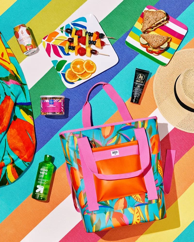
Tabitha Brown for Target
From 2022 to 2023, Target partnered with beloved actress and social media personality Tabitha Brown on four exclusive limited-run lines of home decor, food, and more.
- Magazine copy
- copyediting
See projectClose

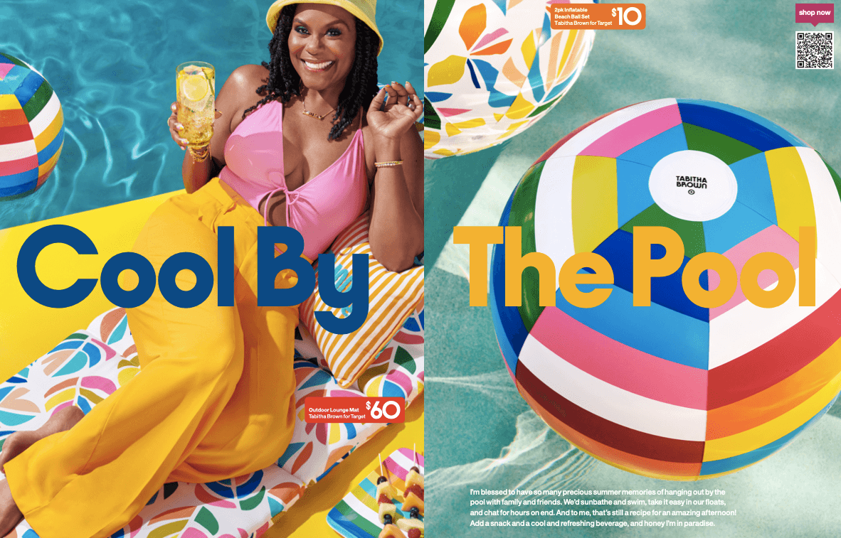
From 2022 to 2023, Target partnered with beloved actress and social media personality Tabitha Brown on four exclusive limited-run lines of home decor, food, and more. NYC agency Mythology created four issues of TAB Mag—a joyful celebration of Tabitha’s favorite things—to go with each release.
I worked with the creative team at Mythology on copy for the fourth issue of TAB Mag, which was focused on easy, breezy ideas for outdoor hosting. I also copyedited issues two through four, making sure each was polished and ready for print.
- Role:
- Copy, Copyediting
- Agency:
- Mythology